Opera Mobile 9.5: Full of Promise–and Rough Edges
By Harry McCracken | Thursday, July 17, 2008 at 10:25 am
Back in February, the Norwegian Web wizards at Opera previewed a new version of Opera Mobile at the Mobile World Congress show in Barcelona. It looked like it might be the phone browser that folks who don’t own iPhones have been waiting for. The company promised a public beta, but its timetable slipped so much and so frequently that I decided to stop being excited about it until it showed up.
That day is here–Opera has released a free public beta of the browser. The beta is still a very rough draft of the product that Opera touted back in February–it’s for Windows Mobile only (a Symbian version is also in the works), and lacks important features such as Flash support. I encountered bugs, such as the way the browser insisted on popping up an onscreen keyboard for URL entry even though the Tilt has a real keyboard.
Opera says that the beta is 2.5 times faster than Pocket Internet Explorer, the antique that’s the default browser on Windows Mobile devices; I haven’t done any formal speed tests, but on my 3G AT&T Tilt, pages rendered into place bit by bit in a way that usually didn’t feel anywhere near as zippy as Safari on the new iPhone 3G.
Opera Mobile 9.5 is, in other words, a true beta that doesn’t claim to be entirely ready for prime time. It’s a promising one, though, and anyone who’s serious about Web browsing on a Windows Mobile device and isn’t intimidated by beta code should give it a try.
Like Safari on the iPhone and Opera’s Java-based Opera Mini)–and unlike Pocket Internet Explorer–Opera Mobile now uses zoom-in/zoom-out navigation: When you land on a new page, the browser squeezes as much as possible on the screen, rendering the formatting much as it would appear in a desktop browser. You then tap to zoom, and can pan around the page. (You don’t get the multi-touch, fingertip precision that the iPhone provides, but bopping around a page using the Tilt’s stylus or my finger worked quite well.)
Here’s CNN in zoom-out and zoom-in view:


On my AT&T Tilt, I instantly found that the biggest issue was not the browser itself but the available screen real estate. Like most Windows Mobile phones, the Tilt has a 240-by-320 pixel screen, with half the pixels of the iPhone’s 320-by-480 model. That’s just not enough to make the zoom-out/zoom-in browsing experience nearly as intuitive and practical as it is on the iPhone.
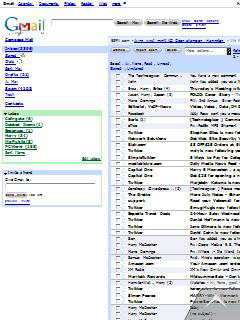
For instance, here’s Gmail as it looks when I load it into Opera Mobile. Except for the Gmail logo itself, all the text’s too small to read–there just aren’t enough pixels to render characters in legible form:

But when I zoom into a more legible view, I don’t see enough of the page to let me make much sense of my inbox:

I ended up using Gmail’s mobile view (m.gmail.com), which is designed to work well in browsers with limited screen real estate. (I found, incidentally, that Opera Mobile always loaded the desktop version of sites I went to, even when there was a phone-optimized one; the iPhone’s Safari automatically loaded phone versions of Gmail, MSNBC.com, and other sites.)
Opera Mobile still offers a “Mobile View” that converts Web pages into long, skinny columns that wrap text to fit onto the phone’s screen. It’s an crude, old-fashioned tactic that’s reminiscent of Pocket Internet Explorer…and for some sites, it’s more practical than zoom-in, zoom-out. As far as I can tell, you can only get to it through a Settings option; I wish there was a quick way to turn it on or off for the particular page you’re on.
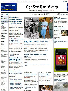
On the plus side, Opera is smart enough to go into a full-screen mode whenever you don’t need toolbars or menu items, thereby using every available pixel to render the Web page. Here, for instance, is a comparison of the New York Times homepage on Opera Mobile 9.5 on the Tilt (top) and Safari on the iPhone (bottom). The iPhone does have more pixels to play with, but since it uses some of them to display your phone carrier, signal strength, the current time, Bluetooth and battery status, the URL, and icons for search, refresh, bookmarks, tabs, and back/forward navigation, the Times itself doesn’t look radically better.


On Windows Mobile phones, Opera Mobile faces potential stiff competition from Skyfire, a browser that’s also reminiscent of iPhone Safari, and which uses proxy browsing to offer the potential of the most desktop-like, accurate Web experience yet. But Skyfire’s in private beta, and the version I’ve tried has some usability problems that get in the way of its considerable promise. Then there’s Windows Mobile 7–you gotta think that it’s going to come with a version of Internet Explorer that’s much, much better than the current one. But it’s not here yet, and won’t ever run on some current Windows Mobile devices.
The bottom line at the moment? Opera needs to polish up Opera Mobile 9.5 quite a bit before it starts charging for it. (Version 8.65, its predecessor, sells for $24.) Once it’s finished, it won’t outdo iPhone Safari, and can’t until Windows Mobile hardware gets better. But even its current form, it’s a browser which outdoes Pocket Internet Explorer in most respects that matter–and I bet a lot of serious Windows Mobile users will adopt it as their primary browser right now.
2 Comments
Read more:


November 19th, 2008 at 9:47 am
I agree with your desire for a quick way to switch “mobile view” on/off in Opera 9.5 (like PIE has on the Fuze). Going to settings every time is qute a hassle. Has anyone figured out a quick-switch method?
March 22nd, 2011 at 11:11 pm
Opera is leading company in browser. I am a fan of Operamini for mobile. I want to ask on question that my opera mini doesn't support querity keypad. Can I get new version according to my demand?