Google’s Interesting, Useful, Odd, Imperfect Fast Flip
By Harry McCracken | Monday, September 14, 2009 at 6:35 pm
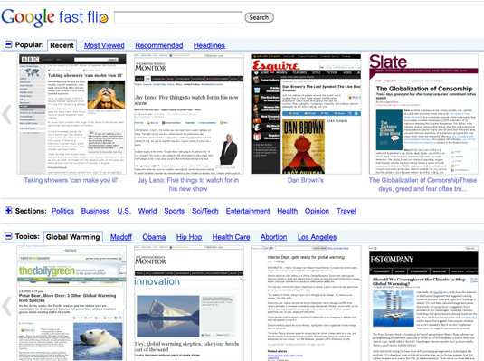
 Did I just say that one of the differences between Bing and Google is that Bing is splashy and Google revels in its plain jane interface? I lied. Google had a TechCrunch50 announcement of its own this afternoon, and involves a new Google Labs feature that has a high “wow, lookee there!” quotient: Google Fast Flip.
Fast Flip is based on Google News, and Google says it came up with it to address the fact that browsing through news sites is usually a slow process–not at all like the effortless instant gratification of flipping through a magazine or newspaper. Google has partnered with several dozen news sources–including the BBC, BusinessWeek, the Christian Science Monitor, the Daily Beast, Esquire, the New York Times, Newsweek, Salon, Slate, and TechCrunch–to create previews of their stories that live on Fast Flip but which display the first several paragraphs of the article in a form that looks like the originating site. You rifle through these previews by clicking left and right arrows, and the pages zip on and off-screen in high-speed, fluid animation–hence the “Fast Flip” name.


Fast Flip has a Like button that lets you express your approval of stories you like, and Google says that the more you use the service, the smarter it will get about presenting you with stuff you’re likely to be interested in. (It lets you browse in multiple ways–by subject, by provider, and by author.) Oh, and there are mobile versions for iPhone and Android.
It’s quite neat–pretty addictive, actually. But it’s also…kind of odd. For several reasons:
It doesn’t necessarily make browsing for news faster. The flipping interface shows one story at a time in legible form–versus the dozens that plain ol’ Google News puts on one screen–along with thumbnails in which the headlines are tiny and the articles themselves are too tiny to read. Once you click on a preview, you go to the originating site–which is no faster than usual–and getting back to Fast Flip may be kinda cumbersome, especially if you’ve clicked through to a multi-page article.
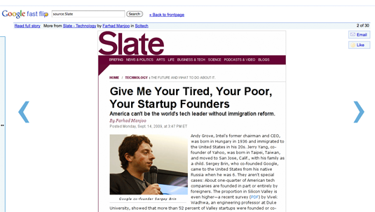
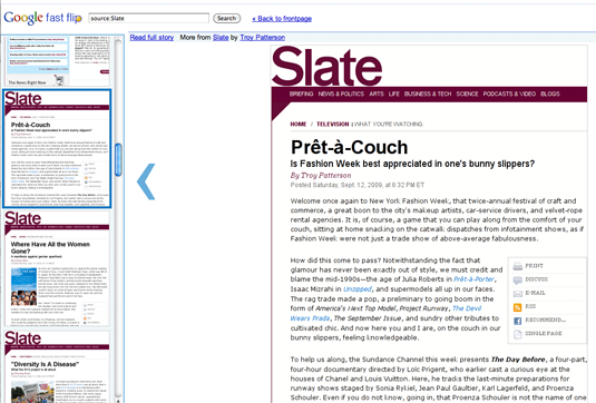
The previews break some conventions of the Web. They may have what seem to be hyperlinks, and tools like icons for printing the page, but none of this stuff works–the preview is a giant hyperlink to the article on the originating site.
The ads are un-Google-esque. Google is putting ads in Fast Flip and sharing the revenues with its content partners. Unlike classic Google text ads, these are display ads–tall, skinny ones–and while they’re context sensitive, some of the ones I’m seeing so far are a tad on the cheesy side:

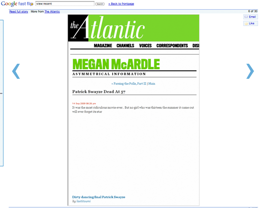
It doesn’t always work. Fast Flip doesn’t carry a beta tag, but it’s a Google Labs project, so it’s experimental by definition. I found it a bit quirky–one Slate page was so wide it didn’t fit in the preview, for instance. And this one-line Atlantic blog post doesn’t really need a preview, except that Fast Flip fails to display the embedded video that makes the text make sense:

I don’t mean to be overly nitpicky–Fast Flip is clever, and I hope it sticks around and evolves. If you check it out, let us know what you think.
3 Comments
Read more:
2 Comments For This Post
1 Trackbacks For This Post
-
Flipping news models | b r a n t s Says:
September 23rd, 2009 at 9:07 pm[…] and you can click through to the source site, if you want to read the full story. It has its rough edges, and is far from being any sort of killer to anyone, but its a damn good start, much better than […]


September 14th, 2009 at 9:43 pm
Thanks for good job, Harry! FastFlip is cool, but needs a lot of improvements.
September 15th, 2009 at 7:27 am
why i say fast flip wont work http://blog.cartercole.com/2009/09/review-of-google-fast-flip-why-i-think.html