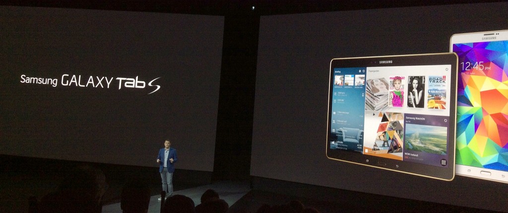
Samsung’s Ryan Bidan presides over the Galaxy Tab S launch event at Madison Square Garden in New York City on June 12, 2014
There are several different ways that a hardware maker can try to build a tablet that’s better than the model which defined the category and continues to lead it, Apple’s iPad. It can make one which is a lot cheaper, or a lot different. Or can build something that’s conceptually similar to the iPad, but attempt to make it better.
Samsung being Samsung, it’s tried all of these approaches with its Android tablets. And the Galaxy Tab S, which it announced at an event I attended at Madison Square Garden on Thursday night, is that last sort of tablet: one which attempts to beat the iPad at its own game.
Starting in July, it’ll be available in two screen sizes, 10.5″ and 8.4″, which will start at the same prices as the 9.7″ iPad Air and 7.9″ iPad Mini With Retina Display–$499 and $399, respectively. That’s with Wi-Fi; versions which also pack LTE wireless broadband will arrive at a later date.
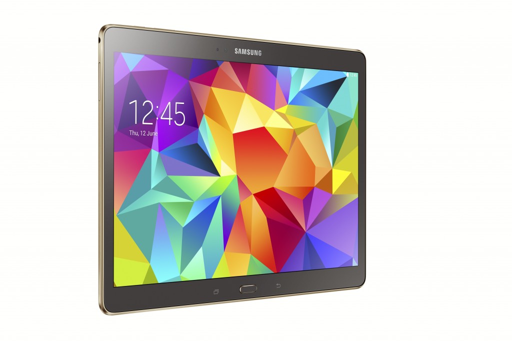
From an industrial-design standpoint, both Galaxy Tab S models have the same bedimpled plastic back as the the Galaxy S5 phone, in two color choices: white or bronze. By almost anybody’s standards, that isn’t as classy as the iPad’s aluminum chassis. But these new Samsungs are pleasing tablets to hold and use: They weigh about the same as their iPad equivalents even though they have bigger screens, which makes them among the lightest tablets on the market. And at about .29″ thick, they’re even thinner than iPads.
The Galaxy Tab S’s most notable feature–and its most striking selling point compared to the iPad–is its display. Instead of an LCD, both versions of the tablet sport Super AMOLED screens, a familiar technology on phones such as the Galaxy S5 but a rarity on tablets. The resolution is 2560-by-1600 at an aspect ratio of 16:9; these are the highest-resolution, largest-screen AMOLED tablets to date.
Samsung spent much of its presentation going over the virtues of Super AMOLED as the company has implemented it: vivid colors; a broader color gamut than LCD, resulting in greater color accuracy; better legibility in sunlight; and adaptive technology which dynamically tweaks the image for the lighting environment and for text, still images, photos, and other content types, even if more than one of them is on screen at a time.
I got to spend some up-close time with Galaxy Tab S units after the presentation, and the screen did look awfully good; as usual with Super AMOLED, the colors were so rich that if anything, I worried about the possibility of them being unrealistically intense. But it’s not tough at all to imagine someone comparing the Galaxy Tab S screens to those on the current iPads and preferring Samsung.
Both Galaxy Tab S models have one other significant hardware feature not available in any current iPad: a home button which doubles as a fingerprint scanner. Among other things, they use it to unlock privacy and multiuser modes which Samsung has added to Android’s stock functionality. I hope it works better than the scanner on the Galaxy S5, which is nowhere near as elegant as the iPhone 5s’s TouchID.
Neither Galaxy Tab S is an iPad-slaughtering Great Leap Forward, but they’re both really nice pieces of hardware. Which brings up the aspect of these tablets which Samsung has the least control over: software and services.
As usual, the company hasn’t been shy about reworking aspects of Android and slathering on its own features. The Tab S models can display two apps on screen at once. Scratching the same general itch as the Continuity features which Apple announced last week at WWDC, they have SideSync 3.0, which lets you use Wi-Fi to project a Galaxy S5’s screen onto the tablet’s display, make and receive calls, and transfer files back and forth; and a similar feature for tablet-PC integration called Remote PC.
Samsung also isn’t satisfied to offer Google’s content stores on its tablets and leave it at that. It has its own music service, Milk, which is powered by Slacker. And it’s introducing Pagegarden, a magazine store which offers interactive titles from publishers such as Conde Nast and National Geographic, customized for the Galaxy Tab S display.
Modifications and additions such as these are dangerous; even if they’re useful, as some of Samsung’s tweaks appear to be, they introduce the risk of bloat and inconsistency. But the thing is, no matter how capably Samsung customizes Android, it can’t do anything about the most glaring weak spot of any competent Android tablet: the paucity of third-party apps designed to work well on a tablet.
I happen to think that iOS has won the mobile app wars, but the selection of apps for Android smartphones, even if it’s in second place, is more than good enough. That’s not true for tablets: More than three years after Google first got serious about tablets with Android 3.0 Honeycomb, it’s not even in the league next door to the league inhabited by the iPad, which now has more than a half-million apps designed especially for it.
Samsung, of course, would never concede that. Still, I got the sense that the company understands it’s an issue. Its presentation on Thursday night emphasized that web browsing has long been the most popular tablet application, but that video has surged into a virtual tie for first place. For browsing the web and watching videos, both Galaxy Tab S models do look like they’d be outstanding.
But because of its massive third-party app advantage, the iPad retains a formidable advantage as an overall experience, over the Galaxy Tab S and every other Android model.
There’s never been any evidence that Google sees this situation as a crisis which demands an ambitious, ongoing response on its part. Too bad for Samsung; too bad for Android fans; too bad for the general state of tablet competition.


Ah, the age old “Android lacks tablet apps” myth. It amazes me how apple managed to brainwash everyone into thinking you needed a separate app for tablets just to conceal the fact that iOS handles app scaling very poorly (largely because it didn’t have to as it only had to run on 2 different resolutions originally).
If coded according to Google’s guidlines any android app is automatically a “tablet” app. Google doesn’t really need to do anything other than push app developers to follow the guidlines.
A tablet app is not a phone app scaled up to tablet size.
Actually on android their isn’t either. Instead there is one app that, when following the following design guidelines:
“When writing an app for Android, keep in mind that Android devices come in many different screen sizes and types. Make sure that your app consistently provides a balanced and aesthetically pleasing layout by adjusting its content to varying screen sizes and orientations.
Panels are a great way for your app to achieve this. They allow you to combine multiple views into one compound view when a lot of horizontal screen real estate is available and by splitting them up when less space is available.” http://developer.android.com/design/patterns/multi-pane-layouts.html
will look as good on a small display as on a large one.
Yes, everyone knows it is possible to make an Android tablet app, by entirely redoing your layout for larger screens. Some people, however, don’t seem to realise that most developers have not bothered, because they get a badly scaled phone app for free. Hence the abysmal Android tablet app situation that isn’t getting better.
That’s certainly Google’s stance on tablet apps. There are some examples of apps that scale up beautifully, or at least decently. But there are lots and lots of them which don’t scale well–either you end up with a lot of white space, or you just don’t take advantage of the additional screen real estate in ways which you could have if you designed an interface specifically for a tablet screen.
I do think that there are issues with the fact that iOS interfaces don’t scale, and I’ll be fascinated to see how Apple resolves them when it finally offers a larger-screen iPhone. But to me, the fact that the platform involves designing a new interface for an iPad app rather than upscaling the phone one is a major plus, not a limitation.