Week before last, Jeff Bezos sent journalists who had been invited to the company’s media event a copy of his favorite childhood book: Leonard Kessler’s Mr. Pine’s Purple House. Mr. Pine painted his home purple so it would stand out from his neighbors’ houses; Bezos included a note alluding to the world “being a better place when things are a bit different.”
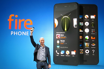
As expected, the news at the media event was the launch of Amazon’s first smartphone, the Fire Phone. In multiple ways, it is indeed a purple house–a phone which strives to carve off a distinct niche for itself rather than match what Apple and makers of Android phones are doing.
 I’d never heard of Mr. Pine’s Purple House, but Mr. Pine was a long-lost childhood friend of mine. When I was a kid, one of my favorite books was Mr. Pine’s Mixed-Up Signs, in which our hero confuses an entire town by (accidentally) filling it with signs erected in the wrong places.
And it seems to me that the Fire Phone is so different from most other phones that it’s likely to confuse people. If you’re not used to purple houses, after all, they’re hard to judge–especially if you haven’t seen one in person. (I attended Amazon’s event and got about a half hour of close-up exposure to a Fire Phone, but the device won’t reach consumers until July 25.)
Herewith, some of my impressions of the phone so far. Some of them depart from the conventional wisdom; in other cases, I think that anyone who has a definitive opinion may be jumping the gun…
It’s not just an Amazon shopping machine.
Even before anyone knew anything for sure about Amazon’s phone, everyone assumed that its purpose, first and foremost, would be to get you to buy stuff from Amazon. Now that all has been revealed, people are still saying that.
That strikes me as being as much a reaction to Amazon’s reputation as to the phone the company actually announced, and a tad unfair. Yes, it would be silly to buy a Fire Phone if you had no interest in purchasing anything from Amazon–just as it would have been silly in the early days of the iPhone to buy one if you had an aversion to buying digital content from Apple.
But in several respects that matter, the Fire Phone is the least Amazon-centric piece of hardware which the company has created to date:
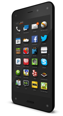
- Unlike Kindle e-readers and early versions of Kindle Fire tablets, its interface emphasizes apps–in a conventional grid of icons–over Amazon content.
- The Carousel–which does play up Amazon content–is part of the Fire Phone’s interface, but it’s secondary to the standard icon grid. And now the Carousel has features unrelated to Amazon commerce, such as widget-like previews of your email and calendar.
- Firefly–the technology which lets the Fire Phone identify real-world objects–should make it ridiculously easy to purchase products from Amazon. But unlike past locked-down Amazon technologies, it has an open API which lets other companies use Firefly to enable functionality in their apps. Maybe even including companies other than Amazon which want to make it easy for you to buy things.
The pricing is a bigger deal than it sounds.
 When Amazon gets into a new device category, people expect it to sell the hardware for cheap with the expectation that it’ll make money later on content sales. (It’s also normal for some of the punditry to involve the idea of the company just giving away hardware, even though it’s never actually done that.)
Unlike Amazon’s Kindle Fire tablets–which are much cheaper than roughly comparable iPads–the Fire Phone is being launched at a very conventional price: $199. But Amazon isn’t just matching the going rate as established by the competition.
The base-model Fire Phone comes with 32GB of storage, which is double what the iPhone and other models offer. It includes unlimited cloud storage of all the photos you take at full resolution–which is, remarkably, a feature which no other phone maker has yet offered. And for the time being, it comes with a year of Amazon Prime service–which, besides shipping discounts, includes impressive collections of streaming video and e-books, plus a modestly interesting music service.
Disruptive? No. But if other phone makers start to bundle more services with their phones over time–and I’d be surprised if they didn’t–we may look back at the Fire Phone as having helped instigate a meaningful industry trend.
Dynamic perspective needs a killer app or two.
Before Amazon announced its phone, there were tantalizing, slightly disturbing rumors that it featured some sort of 3D display. They turned out to be true. But “dynamic perspective,” the technology in question, has nothing to do with conventional 3D which tries to approximate the effect of stuff popping out of the screen–as seen in, say, Nintendo’s 3DS)–and which makes my eyeballs ache.
 Instead, dynamic perspective uses four front-facing cameras which track your face, plus a motion sensor, to redraw the screen at sixty frames per second to reflect the position of the display in relation to your eyes. It looks like there’s a world inside the screen which you can peer into; some of the animated lock screens make you really crane your neck to see little details hidden almost out of view.
It’s a neat effect. But no lock-screen animation, no matter how nifty, matters enough to be a smartphone’s defining feature. Especially since many people choose to put a personal image such as a snapshot of a loved one on their lock screens, a preference which Amazon acknowledges by making it easy to swipe from the dynamic-perspective animation into a photo album of your choosing.
Dynamic perspective also makes a grandiose appearance in Amazon’s maps app, where models of landmarks tower above the street grids below. During the media event, Bezos argued that this was useful rather than a gimmick, since it allows you to peer behind elements which might be obstructing things you want to see. Maybe–but when I tried it out, the main thing I noticed was that as I moved my head, San Francisco’s Transamerica pyramid building looked like it was teetering and might topple over altogether.
Then there are places where the technology is pointless or worse: In the phone’s email app, I noticed that the text at the top of the screen was rendered with a tacky, distracting smidge of perspective, as if Amazon were worried we’d forget that it had equipped the handset with four cameras and sophisticated head-tracking software.
The one place where it seems pretty obvious that dynamic perspective will be a source of joy–assuming developers embrace it–is games. Other than that, the burden is still on the feature itself to prove that it’s something more than a very, very technically sophisticated optical illusion. The good news is that the technology open to third-party developers from the start, which means that it’s possible that someone other than Amazon will come with up with its killer app.
Any other comments about the interface?
Yes. It looks like it requires some learning. A lot of gestures you already know from iOS and/or Android work similarly on the Fire Phone, but there are also some new ones, such as panels–vaguely reminiscent of Windows Phone–which you can call up by tilting the phone to the left or right. But as I wiggled the phone back and forth, I only got the panels to appear once out of around a dozen tries. (Presumably it’s easier once you get the knack.)
Another element struck me as particularly bizarre: If you’re choosing a new dynamic-perspective lock-screen animation and want to preview it, you…press the power button twice. How anybody is going to stumble across that feature, I do not know.
Starting with its original gadget, the 2007 version of the Kindle, Amazon has a history of releasing first-generation devices with glitchy, idiosyncratic interfaces, and then cleaning them up in subsequent software updates and additional generations of hardware. Its current e-readers and tablets are all pleasingly refined, but the Fire Phone is its first attempt at a smartphone–and given how ambitious a phone it is, it would be a miracle if it came out perfectly polished from the get go.
More thoughts to come once I’ve spent more time with a Fire Phone.


Without Google app ecosystem, it seems like a waste to me.