(Image borrowed from Geek.com)
Software developers have a strange attitude towards notifying their customers of product error. They rarely just explain what happened, and apologize. Well, sometimes they do try, but with an explanation so technical that it’s pointless for us normal human beings. (That may or may not be better than providing an error code rather than actual information on what went wrong.)
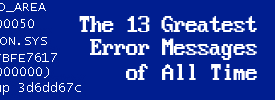
There’s also a long-standing tradition of error messages being accompanied by humorous visuals, dating back at least to the Mac’s Bomb and Sad Mac icons, and probably much further than that. And now Geek.com is reporting that Windows 8 has a new sort of Blue Screen of Death that sports an oversized frowny face emoticon. (The developer preview of Windows 8 is buggy, but I haven’t run into any catastrophic errors that trigger this screen myself.)
I don’t get it. Are there any other industries that see failure as an occasion for merriment? I love Chrome, but its suffering browser tab and messages such as “Aw, Snap!” always leave me slightly more irritated than if I’d just gotten a straightforward alert that something had gone awry.
Of course, Windows 8 is merely a developer preview, so its error messages are presumably subject to further tweaking. How about dumping the frowny, Microsoft?
(Side note: The one cheery error message I like is Twitter’s Failwhale, in part because it was designed by my friend Yiying Lu. In fact, I’m almost sorry I rarely see it these days…)


