The New Ask.com: A Little Less Distinctive
This upgrade to the innovative search engine undos some of its innovation.By Harry McCracken | Monday, October 6, 2008 at 12:07 am
 I really liked the new version of Ask.com that arrived back in June of 2007–in part because it was so clearly not Google or a shameless Google wannabee. That version sported a three-pane interface that divvied results up into discrete sections for Web pages, news, images, video, and more. It was a strikingly different approach than Google’s Universal Search, which weaves results of all sorts into one list.
It would seem that consumers didn’t greet a radically different Ask.com as warmly as I did–Comscore data for August 2008 shows Ask with 4.5 percent of the search market, down from 5 percent in May 2007, right before that redesign. Fifteen months later, Ask has released another new version, and it’s dumped the divvied-results feature in favor of something that looks a lot more like Google, previous versions of Ask, and most every other search engine on the planet.
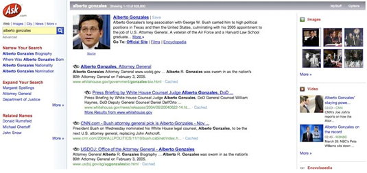
Here’s a screen I captured of the Ask.com I dug back when it was new, and former Attorney General Alberto Gonzales was in the news, so I searched for his name:

And here’s the new Ask’s results for the same query:

Lots of little changes: The blocks for Images, Video, and Encyclopedia on the right-hand side are gone. But the new Ask wove image results into the Web results–just as Google often does. Options for “Narrow Your Search” and “Expand Your Search” are gone, and Related Searches have been moved from the left-hand side to the right, and there are three times as many of them. Tabs for Images, News, and other specialized results have been moved from that left-hand pane that doesn’t exist any more to above the main results–a lot closer to Google’s presentation.
Also new, and neat: A link to related questions at Ask Q&A, a Yahoo Answers-style feature. And both old Ask.com and new Ask.com–for the search above and lots of others–lead off the results not with a standard Web result but with a little box with a snippet of information and links to related sites.
So what else is new? Well, Ask is encouraging folks to type in queries in the form of questions and see what happens. But the two examples it provides–“Is Cops on TV tonight?” and “What causes headaches?“–don’t provide results that are particularly spectacular. The former results did include a link to a Fox Network schedule, but I had to find that link, click on it, and then scroll until I found the information for Cops. (When Ask suggested the search, I kinda wondered if the schedule information would show up right in the results.) The latter query also doesn’t provide an answer right in the results–actually, its results are very similar to Google’s, and information on the causes of headaches is just as far away.
I tried a bunch of other searches of my own, and didn’t find results that were enough different from or enough better than Google’s to form a strong opinion of how Ask compares–though I did note that the first result was often the same for both services (random example: here’s “How often should I water my lawn?” in Ask and Google).
Ask also says that its new version is faster: I can’t do a meaningful comparison, but for what it’s worth, the new version seems plenty zippy.
Search junkies will find more features in Ask than in Google: One I haven’t mentioned yet is previews of sites that let you see a pop-up glimpse of what they look like before leaving your results:

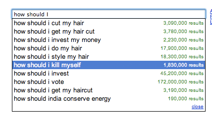
And Ask retains its search suggestions, a feature that it had long before Google’s recent rollout of the practically-identical Google Suggest. With both Ask and Google’s versions, though, I find the search queries that the engines give me as I type as much intriguing as useful in most cases. And it’s fascinating to compare the recommendations. Here’s what I got from Ask when I began to type “How should I…”

And here’s Google:

As far as I can tell, both Ask and Google users are really interested in their hair and investments, but Ask users eat more pomegranates and Google users are (eek!) more likely to contemplate ending it all.
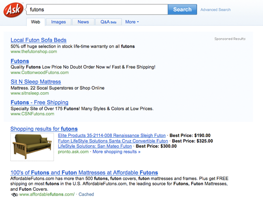
There’s one aspect of Ask that I find both confusing and annoying. Like most search engines, including Google, it usually tops search results with a few Sponsored Results (read: ads). But if frames them in a light green box that’s so incredibly faint that I didn’t see it at all until I squinted, and even then I wasn’t positive whether it was really there:

Compare that to the yellow box around Google’s sponsored results:

Whether Ask made the box so faint in order to make it tough for its users to tell an ad from a non-sponsored result, I don’t know. But I do know that this presentation diminishes the effectiveness of the new version’s emphasis on putting useful information right at the top of the organic results, since it’s hard to tell where the sponsored results end and the organic ones begin.
What’s the bottom line on the new Ask? It’s got some nice touches and interesting features that make it worth a look–and no matter how much you love Google, I recommend trying other search engines from time to time, just so you know what’s out there and so that Google never develops a stranglehold on the market that’s based more on inertia than quality. But the new Ask.com is a less distinctive choice than the old one–it’s rearranged things in ways that are more Google-esque than before.
If that’s what research told them Web searchers want, then it’s hard to argue with the decision, I guess…but you gotta wonder whether the search engine that succeeds in chipping away at Google’s dominance will be one that’s rather like Google, as the new Ask is, or a whole lot different in fundamental ways…which is the direction Ask seemed to be going until now.
4 Comments
Read more:
1 Comments For This Post
3 Trackbacks For This Post
-
Ask: The Little Search Engine That Couldn’t | John Paczkowski | Digital Daily | AllThingsD Says:
October 6th, 2008 at 6:34 am[…] dominated by Google. And try as it might — with both redesign and ad campaigns –the company just can’t seem to build any audience beyond that. So there’s little reason to believe that Ask’s latest redesign — its third in as […]
-
Google/Bing: Minimalism vs. Maximalism | Technologizer Says:
December 3rd, 2009 at 2:14 am[…] to experiment with being different from Google. (Ask.com comes to mind–but lately, it’s looking more like Google than it used to.) But I don’t think any Google rival has attempted to be, in effect, the opposite of Google. […]
-
Yet Another New Ask.com Says:
July 27th, 2010 at 11:11 am[…] new Ask replaces a not-particularly distinctive version that was launched in October 2008. That one superseded one from June of 2007 that I really […]


October 9th, 2008 at 2:56 pm
I really like the new ask and will probably use it over google for a bit to see how it fairs. I like the ui and the results seem slightly more relevant than those from google.