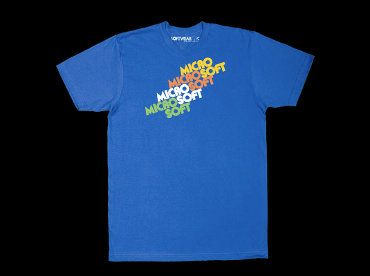
Microsoft’s Latest Innovation…T-Shirts!

For a company that’s thirty-three years old, Microsoft has gone through surprisingly few major rebrandings. The only two logos I remember, in fact, are the current one (which is getting a tad long in the tooth) and this 1980s-era design. Guess which one I like better?


By Harry McCracken | Sunday, December 7, 2008 at 12:32 am
See all: Original Site, Slideshows