Sonos Upgrades and Downsizes Its Controller
By Harry McCracken | Tuesday, July 28, 2009 at 12:41 pm
![]() Sonos, the company whose multi-room music system is one the most thoughtfully-designed products in all of consumer electronics, just retired the remote control that’s been a part of its offering from the start in favor of an all-new design.
Sonos, the company whose multi-room music system is one the most thoughtfully-designed products in all of consumer electronics, just retired the remote control that’s been a part of its offering from the start in favor of an all-new design.
The old model worked well, but it was big and brick-like and maybe even a little clunky by Sonos standards, with a design that drew obvious inspiration from old-school iPods:

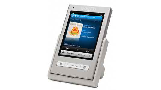
The new Sonos controller performs the same functions as the old one, but it’s a pretty dramatic upgrade in terms of industrial design and user interface. It’s the size of a thick PDA, and sports an aluminum case that gives it an extremely solid feel. Most of the old controller’s buttons are gone–the new one features a 3.5-inch color screen and a touch interface that was snappy and intuitive when I tried it at a Sonos event last night:

The new controller goes for $349, and includes the dock; that’s a significant price break over the old model, which cost $399 and made you pay $40 extra for the dock. Owners of iPhones and iPod Touches can choose to control Sonos systems with the excellent free iPhone app instead. (Its interface isn’t exactly the same as the one on the new controller, but has a generally similar feel.) And with an 8GB iPod Touch going for $229, I’ll bet some cost-conscious Sonos buyers will get their systems sans controller and buy a Touch instea.
2 Comments
Read more:


0 Comments For This Post
2 Trackbacks For This Post
September 4th, 2009 at 2:35 pm
[…] enough to make the new Twitter function appealing. The application will work from both the new Sonos Controller hardware and and their iPhone applater this […]
March 21st, 2010 at 5:42 pm
[…] The iPhone remote control app is quite impressive. Considering all it does, including replacing a dedicated piece of hardware and despite my little UI nav nits. However, there are plenty of folks who don’t own Apple […]