YouTube Tries Out a New Look
By Harry McCracken | Thursday, January 21, 2010 at 11:02 am
Has YouTube ever done a truly sweeping redesign? If so, I don’t remember it. Mostly, I think of the scads of features the site has added–many of which are useful, but all of which have led to a cluttered experience.
Today, YouTube is launching a major makeover of its video playback page, based on feedback from users. For the moment, it’s not replacing the old one–it’s an opt-in feature which you can get by going here. The company says the plan is to get further feedback from users and tweak it further before it becomes the default interface
The major goals were to reduce the amount of wordage and graphics that weren’t completely necessary; to make the most popular features easier to find; and to keep the emphasis on the video being viewed (which could be either hilarious or sobering) rather than the interface. Even the site’s “Broadcast Yourself” slogan is gone in the interest of streamlining.
Also gone in the new version: star ratings. (Instead, you give a video a “Love It” or (“Thumbs Down”) rating. All in all, the site looks much more like a product of its parent company, Google.
Here’s the new look:

And here’s the older, busier version:

The company says that for this first version of its new look, it tried to err on the side of taking things away and removing labels–even the comments no longer have a header explaining that they’re comments. If they get feedback that any of the changes went too far, they may backtrack a bit.
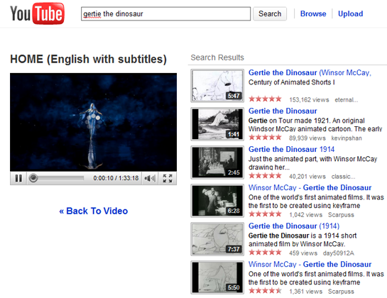
YouTube hasn’t completely redone the other important part of the site–search results–but it is experimenting with a new format that leaves the video you’ve been watching onscreen in a smaller window when you search for something new:

It’s going to take a while for me to get used to some of the changes–like the information about the video’s uploader moving from the right-hand side and being split up into chunks above and below the video–but overall, this looks like good stuff. It’s certainly less claustrophobic than the old version.
If you check it out, let us know what you think.
7 Comments
Read more:
6 Comments For This Post
1 Trackbacks For This Post
-
YouTube Streamlines Itself Says:
March 31st, 2010 at 10:49 am[…] all: Reviews Back in January, YouTube started letting users opt-in to a new streamlined interface. It’s now happy enough with the results that it’s rolling out its new video page to […]


April 7th, 2010 at 9:06 pm
The only thing I don’t really like about this new version is that they replaced the star ratings with the love it or thumbs down thing. It’s harder to see which videos are good, ok, decent, or horibble now. It used to be more exact. It kinda does look like a product of Google too. It’s so neat that it doesn’t really look like Youtube anymore. Just a little too neat. The fact that they let you see the video you were watching when you’re searching for a new video is kinda handy though.
May 24th, 2011 at 12:26 am
The world’s largest video game retailer could be in hot water thanks to some investigative work by Kotaku’s Brian Crecente and Michael McWhertor.Thanks for sharing the informative post.
Regards.
david77
May 24th, 2011 at 2:53 am
The groups I’m working with are off the hook, and I’m really excited about introducing them to the world.Thanks for sharing the informative post.
Regards.
david77
July 22nd, 2011 at 3:31 pm
YouTube is trying a new redesign called for some reason, Panda Cosmic, giving a sleeker, darker look and improved customization options. Gone is the traditional white page. Videos are now left with a darker background to reduce the contrast .
jogos de carros
August 29th, 2011 at 6:42 pm
This technique allows buyers searching for the particular key phrases to locate you on the best jordan 11 high heels
December 2nd, 2011 at 4:13 pm
my password is shown on top right corner
AND I CAN NOT DO ANYTHING
i am scared someone might get it
what is the point to show my password