Twitter for iPad: Great Work, Loren Brichter! What's Next?
By Harry McCracken | Thursday, September 2, 2010 at 9:19 pm
Loren Brichter–the creator of Tweetie, the app that became Twitter’s official Twitter app–is a genius. Or at least one of the smartest software interface designers who’s ever coded. His latest work is Twitter’s official iPad app, and he’s done it again.
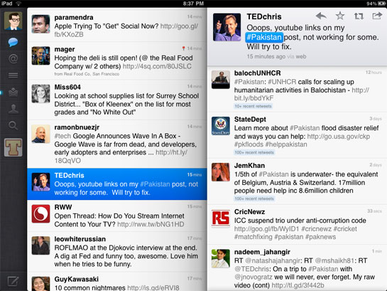
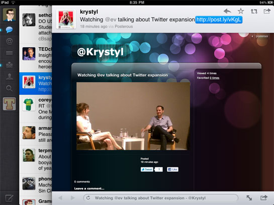
As with Tweetie Twitter for iPhone, this new program manages to be exceptionally approachable and remarkably deep at the same time–and it feels like its iPhone predecessor while simultaneously taking full advantage of the iPad. The interface uses ingenious sliding panels to let you drill down into tweets, Twitter users, and embedded content–you can look at Web pages and even watch videos without leaving the app.
It’s remarkable stuff–possibly the most sophisticated iPad to date from an interface standpoint, and compelling proof that the iPad is so much more than a “giant iPhone.” It also points out a problem with iPad rivals such as Samsung’s Galaxy Tab: Even if they’ve got iPad-like hardware, they’re not going to get iPad-like apps such as this one. (At least not instantly.)

Every time I write about Brichter’s apps, I lavish praise on the guy. I think he’s right up there with software legends such as Bill Atkinson when it comes to bringing imagination and intelligence to software interfaces.
Which, oddly, leaves me feeling kind of worried. When Brichter sold Tweetie, he became a Twitter employee. He did great work on the first official Twitter app for iPhone. He’s done great work on Twitter for the iPad. He’ll probably do great work on future versions of these apps, and possibly on Twitter clients for other platforms.
But I want to see what he can do with entirely different interfaces for entirely different purposes. So while I don’t presume to give Brichter (whom I don’t know) career advice, I hope he doesn’t intend to crank out Twitter clients for the rest of his career. Twitter’s swell, but it just isn’t a big enough tapestry for someone with this much talent. Maybe someone should hire him to design an entire mobile operating system?
2 Comments
Read more:


September 2nd, 2010 at 10:15 pm
I completely agree. This is what every app on the iPad should be. Brilliant.
If hiring him means this kind of quality then companies should steal him from twitter for twice what they’re paying him and it’d be worth it.
September 3rd, 2010 at 10:53 am
It sounds like I'm going to be in the minority here, but the app doesn't do it for me. It certainly wasn't instant love like Tweetie was on the iPhone. Twitter for iPad has lots of bling, with Windows sliding in and out, but there seems like lots of wasted space. That's especially true in lists, which is how I spend almost all of my time in Twitter. Unless I'm missing something, when I'm in a list, 2/3 of the screen is filled up with something other than the stream. I'm going to stay with it a bit to see if it grows on me, but I could see myself back with Twitterific.