Mozilla Chromeless Aims for Build-Your-Own Browsers
By Jared Newman | Friday, October 22, 2010 at 12:50 pm
 User interface is among the most important parts of any web browser, but lately they’re all starting to look the same.
Mozilla Labs’ solution? Chromeless, an experiment that will let people with knowledge of HTML, CSS and JavaScript create their own browser interfaces.
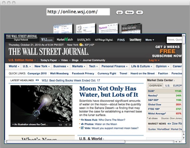
Introducing the idea, Mozilla developer Marcio Galli asks, “What kinds of wild-eyed experimentation would we see if a new conception of browser UI could be prototyped in about the same time it takes to write a web page?” To illustrate his point, Galli posted a simple example that uses page screenshot thumbnails instead of tabs (pictured here).
I really like the idea of Chromeless. While browser interfaces have become highly-evolved, trimming unused menu space and consolidating clutter is not the same as introducing revolutionary new features. If the web browser has any more major leaps in store — something on par with tabs and omnibars — their chances of being discovered will greatly improve if lots of people can easily make their own prototypes. I doubt that any one remix would become popular on its own, but successful experiments could certainly find their way into major browser releases.
Chromeless is still in pre-alpha, and over the next few months, Mozilla will add APIs, security features, and eventually a software development kit for putting together genuine browser remixes. I’m excited to see what people come up with.
3 Comments
Read more:


October 22nd, 2010 at 1:48 pm
Great idea. But not for me. I'm the world's second worst designer (you [each "you" who reads this] can name the worst).
October 22nd, 2010 at 3:24 pm
All looking the same? They are all copying Google Chrome, and so far no one has made a better interface. So long as Chrome remains king I'm fine. That preview pic looks horrible and wastes WAY too much space. Google has already found the answer, it has so many little touches it is almost unbearable how efficient it is.
October 25th, 2010 at 9:38 am
I think you missed the point of the example. It was illustrating that wacky things can be done very easily. It wasn't supposed to be an example of a good interface idea.
As to all of the browsers copying Chrome, one might recall that Chrome is the newcomer who was able to copy the other browsers and then innovate. Turnabout is fair play.