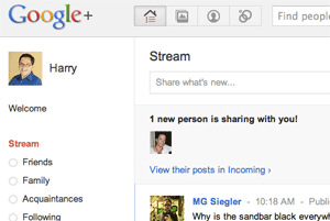
 I’m in at Google+, Google’s new offering that’s less of a monolithic “Facebook killer” and more of a loose network of socially-oriented services. Right now, Google has opened it up to only a small number of folks: it’s an odd world in which nearly everyone is a journalist, a blogger, or a Google employee. But it’s engaging in ways that Buzz and Wave never were–thanks in part to an inventive interface designed by Mac legend Andy Hertzfeld.
(“Often inventive” is probably the better way to put it–there are also parts of + that are borrowed directly from Facebook, like the organization of the home page.)
This post isn’t a Google+ review–I’m cranking away on an unrelated deadline which I’m behind on, in part because I keep taking breaks to check out +. For the moment, here are some other folks’ impressions, most of which are guardedly positive. (The “guardedly” is pretty much a given, considering Google’s patchy reputation when it comes to anything relating to social networking.)
Search Engine Land’s Danny Sullivan: “…this is a much better and more thoughtfully designed product than Buzz.”
TechCrunch’s MG Siegler: “I’ve spent the last several hours using Google+. That’s a good sign.”
PCWorld’s Megan Geuss and Mark Sullivan: “In general we thought the service borrowed some good ideas from the reigning king of social networks, Facebook, but also offers some cool new approaches to sharing content and managing privacy.”
PCMag’s Mark Hachman: “Put simply, Google+ is a social network for geeks.”
More thoughts to come…


 I haven’t spent a lot of time with Google’s new social networking project, Google +, but little by little, it’s drawing me back. That’s not because of the dozen or so people I’m following, or because of the promising 10-way video chat, or even because of the new approach to privacy that makes you sort contacts into groups.


