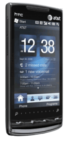
 It doesn’t look or work like Windows Mobile 6.5. It’s not an iPhone OS knockoff. Instead, Windows Phone 7 Series, which Microsoft CEO Steve Ballmer unveiled today at Barcelona’s Mobile World Congress show, looks more like the Zune HD than anything else. And it looks…exciting.
For the first time I can remember, Microsoft is scrapping a major platform and starting from scratch. Windows Phone 7 Series–yes, the name includes a completely superfluous “Series”–isn’t compatible with Windows Mobile. And while Microsoft has always pitched the sheer variety of Windows Mobile phone designs as a primary advantage, Windows Phone 7 devices, which are supposed to show up for the holidays, will apparently be more similar to each other than different. (Microsoft is specifying one CPU, screen resolution, and set of buttons, for instance.)
The 7 interface involves titles that dynamically update themselves with new information, Zune HD-like menus with oversized text, and lots of fluid animation; there are Xbox Live gaming features, and the entertainment capabilities seem to be Zunelike.
It’s dangerous to have your socks knocked off by a demo video, which is all I’ve seen so far, since I’m not in Barcelona. But here is one:
Gizmodo has a good summary of what’s new in the new OS–and like everyone else who’s seen it close-up and blogged about it, Giz is enthusiastic.
Microsoft’s decision to reboot its phone OS was the right one–the only possible one, probably–and if Windows Phone 7’s interface is anywhere near as good as the one on the Zune HD, it’ll be impressive.
I already know I like the fact that it doesn’t look much of anything like Windows 7–for years, Windows Mobile has been inherently hobbled by Microsoft’s insistence that a mobile version of Windows should have a Start Menu and System Tray-like icons and other features which just won’t work well on a teeny-tiny screen.
More thoughts to come…

 Over at the New York Times’ Bits blog, Steve Lohr is reporting on a shocking recommendation from tech analyst/writer Mark Anderson: Microsoft should
 Between