Tag Archives | Opera

Opera’s Browser Hits the Big 10.0

operaiconOpera, the Norwegian browser company that’s focused its attention on phones in recent years, has released an alpha version of Opera 10.0 for Windows, OS X, and Linux. Despite the epochal-sounding version number, Opera 10 doesn’t look to be a great leap forward compared to Opera 9.6, the current version. Opera says it’s faster, scores a perfect 100 on the Acid3 Web standards test, can auto-update itself, has inline spell-checking, and lets its e-mail client delete old mail off the server. All of which sounds either incremental or like it’s playing catchup with other browsers such as Firefox.

(I’ve been playing with the Alpha, mostly because I’m curious whether the speed boost is perceptible: It does feel faster than Firefox 3.0. On some pages. But not others. Basically, I think the speed of my Internet connection has far more impact on how snappy the Web is than the speed of my browser.)

Opera 10.0 may not be a huge whoop, but Opera is still worth checking out–even 9.6 is a solid browser, and an underappreciated one. (Browser market share studies show that it has less than one percent usage; it’s 1.68% here on Technologizer.) Compared to IE, Firefox, Safari, and Chrome, Opera feels like more of a power-user tool out of the box, with built-in e-mail, a cool speed dial feature which shows bookmarks in thumbnail form (replicable via Firefox add-on), and a pretty sophisticated architecture for running widgets that live outside the browser window. (I’m listening to Pandora via one such widget right now.) If you’re a browser junkie like me and haven’t revisited Opera recently, it’s worth a look.

It’s striking, though, how hard it is for a browser–or any application–to introduce truly striking new features by the time its version number nears or reaches double digits. Opera isn’t alone: Internet Explorer 8.0 and Firefox 3.0 are also upgrades to venerable products that have more in the way of technical improvements than groundbreaking functionality. (If Firefox counted all the versions of Netscape and Mozilla that it builds on, dating all the way back to 1994, its version number would be a lot higher.)

And of all the major browser companies, Opera seems to have the least things working in its favor. Microsoft gets to put IE on every Windows PC, making it the planet’s dominant browser (even if its share is slowly degrading). Firefox is the work of a huge open-source community, and its massive add-on library is reason enough for many people to use it. Apple gets to put Safari on every Mac. Google has huge incentive to pour effort into Chrome, and an awesome distribution pipeline if it chooses to use it. Flock, which remains my primary browser, has a well-defined niche.

Opera? Well, it’s widely used on phones, so the company has an opportunity to do interesting things involving tying the desktop and mobile experiences together. But aside from Opera Link, a bookmark-syncing utility that isn’t supported by all versions of the browser, it hasn’t done much to date.

Still, I love the fact the Web circa late 2008 has room for so many browsers. And tell you what: I’m going to switch to the Opera 10.0 alpha as my main browser for the next few days, and report back on my experiences.

4 comments

More on Opera (or the Lack Thereof) on the iPhone

Last week, I wrote about a New York Times story that reported that Opera has written a version of its browser for the iPhone but had it rejected by Apple. Daring Fireball’s John Gruber has a good follow-up post in which he combines reporting, technical analysis, and some scuttlebutt from an informed source to theorize that Opera’s browser–and in this case, as he notes, it’s Opera Mini rather than the fancier Opera Mobile–may not actually have been rejected by Apple, and that its issues on the iPhone may have to do with the fact that it’s a Java app, and the iPhone doesn’t do Java.

Like much relating to iPhone development, this is all pretty murky–but Gruber’s post is illuminating even if his parsing of what may have happened isn’t 100% correct. Go read.

I persist in the belief that iPhone owners shouldn’t have to worry about issues of Java and software interepreters and SDKs and NDAs and such: There’s surely an audience for Opera on the iPhone, and there oughta be a way for Opera to satisfy that audience. And Apple should err on the side of making it possible for third parties to quickly ramp up the catalog of iPhone apps rather than putting obstacles in their way.

I also persist in suspecting that even if the iPhone is less than completely open right now, it will open up over time–competition with other platforms such as Google’s Android will leave Apple with no choice. It’s mainly a question of whether that opening up will happen really quickly or will drag on forever. I hope…

One comment

No Opera on the iPhone? Bad News.

The New York Times’ Saul Hansell has published a piece on browser company Opera, and the biggest news it contains is a passing reference halfway through the story: Opera CEO Jon von Tetzchner says that the company has developed a version of Opera for the iPhone, but Apple has refused to distribute it on the ground that it competes with its own Safari. It’s the latest of multiple examples of Apple nixing competitive apps that’s come to light.

Daring Fireball’s John Gruber has pointed out that this instance may be different from others: If Opera’s browser includes its own JavaScript engine, it violates the agreement that iPhone developers sign, which states that new JavaScript engines other than Apple’s own are verboten. (Other competitive apps that have been banned don’t seem to have violated the agreement.)

I don’t find that particularly consoling. On what grounds is Apple restricting the ability of other software companies to provide alternatives to its own software? Is there any scenario under which it’s better for iPhone users that there be only one JavaScript engine on the iPhone (and therefore effectively only one browser)? Microsoft famously got in legal hot water when it tried to crush the already-successful Netscape Navigator; if Apple won’t let competitive browsers onto the iPhone in the first place, isn’t that much worse?

It is, most likely, the principle of the thing that matters here: Safari is a darn good browser, and I have no reason to think that Opera has come up with something superior. It deserves to have the chance to try, though. And we iPhone owners deserve to be the folks who judge its worth.

I’ve said it before and I’ll probably say it again: I still can’t tell whether the iPhone will turn out to be the most exciting new computing platform since the original Mac, or a fancy but fundamentally hobbled walled garden. But at this point, I’m hungry for scraps of evidence to prove that the latter scenario isn’t the more likely one.

24 comments

Opera Mobile 9.5: Full of Promise–and Rough Edges

Back in February, the Norwegian Web wizards at Opera previewed a new version of Opera Mobile at the Mobile World Congress show in Barcelona. It looked like it might be the phone browser that folks who don’t own iPhones have been waiting for. The company promised a public beta, but its timetable slipped so much and so frequently that I decided to stop being excited about it until it showed up.

That day is here–Opera has released a free public beta of the browser. The beta is still a very rough draft of the product that Opera touted back in February–it’s for Windows Mobile only (a Symbian version is also in the works), and lacks important features such as Flash support. I encountered bugs, such as the way the browser insisted on popping up an onscreen keyboard for URL entry even though the Tilt has a real keyboard.

Opera says that the beta is 2.5 times faster than Pocket Internet Explorer, the antique that’s the default browser on Windows Mobile devices; I haven’t done any formal speed tests, but on my 3G AT&T Tilt, pages rendered into place bit by bit in a way that usually didn’t feel anywhere near as zippy as Safari on the new iPhone 3G.

Opera Mobile 9.5 is, in other words, a true beta that doesn’t claim to be entirely ready for prime time. It’s a promising one, though, and anyone who’s serious about Web browsing on a Windows Mobile device and isn’t intimidated by beta code should give it a try.

Like Safari on the iPhone and Opera’s Java-based Opera Mini)–and unlike Pocket Internet Explorer–Opera Mobile now uses zoom-in/zoom-out navigation: When you land on a new page, the browser squeezes as much as possible on the screen, rendering the formatting much as it would appear in a desktop browser. You then tap to zoom, and can pan around the page. (You don’t get the multi-touch, fingertip precision that the iPhone provides, but bopping around a page using the Tilt’s stylus or my finger worked quite well.)

Here’s CNN in zoom-out and zoom-in view:

On my AT&T Tilt, I instantly found that the biggest issue was not the browser itself but the available screen real estate. Like most Windows Mobile phones, the Tilt has a 240-by-320 pixel screen, with half the pixels of the iPhone’s 320-by-480 model. That’s just not enough to make the zoom-out/zoom-in browsing experience nearly as intuitive and practical as it is on the iPhone.

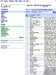
For instance, here’s Gmail as it looks when I load it into Opera Mobile. Except for the Gmail logo itself, all the text’s too small to read–there just aren’t enough pixels to render characters in legible form:

But when I zoom into a more legible view, I don’t see enough of the page to let me make much sense of my inbox:

I ended up using Gmail’s mobile view (m.gmail.com), which is designed to work well in browsers with limited screen real estate. (I found, incidentally, that Opera Mobile always loaded the desktop version of sites I went to, even when there was a phone-optimized one; the iPhone’s Safari automatically loaded phone versions of Gmail, MSNBC.com, and other sites.)

Opera Mobile still offers a “Mobile View” that converts Web pages into long, skinny columns that wrap text to fit onto the phone’s screen. It’s an crude, old-fashioned tactic that’s reminiscent of Pocket Internet Explorer…and for some sites, it’s more practical than zoom-in, zoom-out. As far as I can tell, you can only get to it through a Settings option; I wish there was a quick way to turn it on or off for the particular page you’re on.

On the plus side, Opera is smart enough to go into a full-screen mode whenever you don’t need toolbars or menu items, thereby using every available pixel to render the Web page. Here, for instance, is a comparison of the New York Times homepage on Opera Mobile 9.5 on the Tilt (top) and Safari on the iPhone (bottom). The iPhone does have more pixels to play with, but since it uses some of them to display your phone carrier, signal strength, the current time, Bluetooth and battery status, the URL, and icons for search, refresh, bookmarks, tabs, and back/forward navigation, the Times itself doesn’t look radically better.

On Windows Mobile phones, Opera Mobile faces potential stiff competition from Skyfire, a browser that’s also reminiscent of iPhone Safari, and which uses proxy browsing to offer the potential of the most desktop-like, accurate Web experience yet. But Skyfire’s in private beta, and the version I’ve tried has some usability problems that get in the way of its considerable promise. Then there’s Windows Mobile 7–you gotta think that it’s going to come with a version of Internet Explorer that’s much, much better than the current one. But it’s not here yet, and won’t ever run on some current Windows Mobile devices.

The bottom line at the moment? Opera needs to polish up Opera Mobile 9.5 quite a bit before it starts charging for it. (Version 8.65, its predecessor, sells for $24.) Once it’s finished, it won’t outdo iPhone Safari, and can’t until Windows Mobile hardware gets better. But even its current form, it’s a browser which outdoes Pocket Internet Explorer in most respects that matter–and I bet a lot of serious Windows Mobile users will adopt it as their primary browser right now.

2 comments