Tag Archives | social networking

5Words: Twitter Gets Geographically Savvy

Like 5Words? Subscribe via RSS.5words

Details on Twitter’s geolocation features.

Thirty Windows Mobile 6.5 phones.

Report: Nintendo’s Wii price cut.

Windows 8: early details emerge.

Finally: Starbucks on your iPhone.

OnLive’s cloud gaming service impresses.

AT&T readies iPhone MMS rollout.

Windows 7 party madness continues.

Intel demos new Mobilin OS.

CallSpark: ultimate iPhone address book?

No comments

eSwarm: Forums With a Twitter Twist

eSwarm ReviewOnline forums might lack the pizazz of a Web 2.0 technology, but the conversations folks hold in them consistently remain on topic. A Boulder, Colorado startup called eSwarm has applied the relevance of forums to microblogging in a grassroots business effort to unseat Twitter –starting at local universities.

The eSwarm Web site went live in August, and the company intends to release client applications for the Blackberry and iPhone by the end of October, said co-founder Matt Etlinger. Swarms look a lot like Twitter, but they’re really microblogs that are managed by the person who initiates them; they can be public or private.

Continue Reading →

2 comments

Your Stance on Facebook

Facebook LogoIn a blog post yesterday, Facebook CEO Mark Zuckerberg announced that the social network he founded now has 300 million members. That’s worldwide, but it also happens to be roughly the same number of people who live in the United States–give or take a few million. For a service that’s only slightly over five years old–and which has been open to non-students for less than three years–it’s a lot of people.

Facebook doesn’t seem to inspire the controversy, passion, and hype of oh, say, Twitter: It’s just part of the air that a lot of us breathe these days. The single thing that I like best about it is that it’s put me back in touch with old friends from every stage of my life, including pals I had before I was able to walk.

Which doesn’t mean that everyone’s on Twitter–I know smart folks who are still thinking it over, or who have intentionally steered clear–or that everyone who’s tried it is a fan. T-Poll time:

2 comments

Threadsy: An Intriguing First Draft

ThreadsyYesterday, I was all excited over Threadsy, the Web-based universal communications service that was one of my favorite launches at TechCrunch50. Shortly after I applied for an invite to the private beta, it arrived. So I’ve been using Threadsy–and while I’m still excited about its potential, the hands-on experience also reminds me what a daunting challenge the service’s developers have set for themselves.

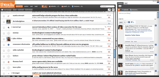
As I mentioned yesterday, Threadsy divvies up communications into Inbound ones (missives directed specifically at you, be they Gmail messages, Twitter @replies or DMs, or Facebook messages) and Unbound ones (status updates from Twitter and Facebook). Besides integrating multiple streams of messages into one list, it creates one master address book, and tries to figure out if one person shows up multiple times in your various accounts. You can also IM from within Threadsy, although it seems to only support Google Talk.

Inbound messages are woven into one stream in a big window on the left, and Unbound ones are in a smaller area on the right. Here’s a screen image (click on it for a larger version):

Threadsy

I still love the idea of having one place to go for almost all my communications. But I discovered that Threadsy doesn’t yet support folders–or, in Gmail parlance, labels–which means that I can’t get at much of my Gmail from within Treadsy, and can’t organize the new stuff that comes in. The company says it’s working on fixing this; until it does, I can only use Threadsy as an adjunct to Gmail, not a replacement for it. And even once folders/labels are up and running, there’s lots of stuff in Gmail that Threadsy probably won’t be able to duplicate, such as Tasks, Stars, and Widgets. Despite interesting work by the likes of Zenbe, it’s probably impossible to be a better Gmail than Gmail.

One other quirk with the current version of Threadsy:  When a status item shows up on multiple social networks–most likely because someone has set things up to broadcast it to both Twitter and Facebook–it shows up twice in Thready’s Unbound area:

Threadsy

You gotta think it wouldn’t be a huge technical challenge for Threadsy to figure out these messages are dupes, and to hide one of them, at least as an option.

Threadsy’s not only in beta, but private beta, so it’s entirely understandable that it’s a rough draft. I plan to keep an eye on it–if you check it out, tell us what you think.

7 comments

Threadsy: All Your Communications, All in One Place

ThreadsyI’m still at TechCrunch50–it’s winding down, but there’s still so much going on that you’ll miss a product launch or two if you so much as take a restroom break. The debut that’s happening right now is one of the most interesting ones so far: Threadsy is a Web-based integrated communications service that looks uncommonly ambitious. It combines your e-mail (it supports Gmail, Yahoo Mail, etc), Twitter, Facebook, and other sources into two clusters of messages: “inbound” ones aimed directly at you (such as e-mail and Twitter @replies and Direct Messages) and “unbound” ones aimed at nobody in particular (such as Facebook status updates). And it tries to weave everything together so that items from a particular friend or acquaintance are tied together no matter which method of communications is involved. And it offers profiles, which seem to be super-address-book entries which are richest if the person in question belongs to Threadsy, but still there if they don’t.

Like Gmail, Threadsy aims to make money by displaying context-sensitive ads based on keywords in your conversations. As I said in my post on the new social-network-aggregating version of AIM, I’m not sure if anyone has really figured out how to combine social networks and related streams in a way that’s simple, powerful, and as appealing as just going to all the information sources separately. But I can’t wait to give Threadsy a try. Apparently I won’t have to wait too long, and neither will anyone else: The service is still in private beta, but the company says that it’ll let in everyone who signs up for an invite over the next few days.

9 comments

AIM Gets More Social

AIMI use AOL’s instant-messaging network all day long, but I’m not sure when I last used the AIM software itself (with the exception of the iPhone version). I’ve associated it with feature bloat, annoying ads, and a sort of old-timy, Web 1.0 feel. So I long ago switched to other clients that support the AIM network (Apple’s iChat when I’m on a Mac, GAIM when I’m on Windows, and the Web-based Meebo anywhere and everywhere).

But AOL showed off new desktop and iPhone versions of AIM this morning at TechCrunch50. The new AIM is distinctly less clunky and annoying, and it aims to be not only an IM client but also an aggregator of social networking info (aka your “lifestream”) from other services, too. The new versions officially launch next week, but betas for Windows and Mac are available right now and the $2.99 paid iPhone version is live on the App Store.
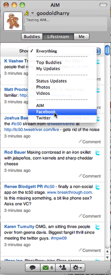
AIM guy with Twitter logoI’m trying the Mac beta, and it’s a Mac AIM client I’d actually use (hey, I’m chatting in another window even as we speak). It seems to lack some of the irritations that drove me away long ago, like ads popping up without warning. As for the social networking features, AOL has added support for Delicious, Digg, Facebook, Fickr, Twitter, and YouTube. It combines them all in a tab called Lifestream, lets you view all of them in one river of updates, or one service at a time, and permits you to broadcast your AIM status to other services whenever you update it. It also displays photos and videos from your pals directly in the AIM window.

There aren’t many things harder to do than elegant integration of disparate social networks–actually, I’m not sure if anyone’s really nailed it yet–and AIM’s implementation, in this beta at least, is imperfect. I’m not sure why you configure networks in your browser rather than in AIM preferences, for instance. And if you’re the type who loves high-powered apps like TweetDeck and Seesmic, you’ll find the AIM client’s support for other networks to be bare-bones at best. I doubt that any semi-serious Twitter user will rely on AIM as his or her only Twitter client, and about 95% of the things that make Facebook interesting (the full-blown wall, events, third-party apps, etc.) aren’t available.

The new AIM makes most sense for folks whose social lives are centered around AIM rather than Twitter or Facebook or another network. There are millions of those people, so it’ll be accomplishing something if all it does is make them happy. As it will be if you can use the new clients without gnashing your teeth and seeking alternative clients less likely to drive you bonkers.

I’m still looking for the ideal social-networking aggregator, but so many companies are working so hard on the challenge that I’m optimistic that I’ll find one that works for me sooner or later.

As for the new AIM client for the iPhone, I’ve downloaded and installed it–but every time I try to view my Lifestream, I get an error. I’ll check back later.

AIM network users, are you still using the AIM client? If not, why not? If you try the new versions, let us know what you think.

One comment

More Lite Versions, Please!

Facebook LogoI think of them as Facebook brain freezes: Every so often, when I’m on the site, I just get overwhelmed by the quantity of features it offers and can’t figure out how to do something simple such as post a photo. They’re a temporary condition, but a frustrating one. Which is why I’m intrigued by Facebook Lite, the new stripped-down-to-the-essentials alternative interface the company launched yesterday.

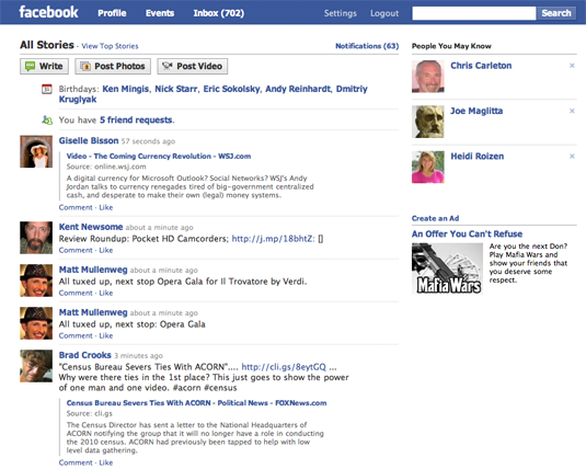
Originally meant for emerging nations such as India where broadband isn’t a given, Facebook Lite is also being rolled out in the U.S. Here’s my home page in Lite mode:

Facebook Lite

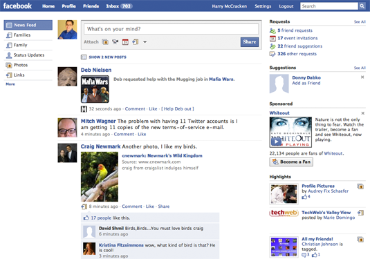
And here it is in heavy standard form:

Facebook Heavy

Facebook Lite does away with third-party apps and a number of inessential fripperies in favor of a more streamlined look. As far as I can tell, it also doesn’t include chat, which is one reason why I haven’t made up my mind whether I’ll use it much. But I really like the idea of an alternative, simpler interface for a feature-rich application, and I hope other purveyors of services and software crib it.

For eons, developers have talked about how 80 percent of users rely on only 20 percent of a typical application’s features. In response, they’ve sometimes come up with simpler versions of well-known apps–Microsoft Works and Photoshop Elements being two examples. Most of these products haven’t been all that good or all that successful–Elements is an impressive exception–and I think part of the problem is that most folks are convinced they’ll eventually need the 80-percent-of-features they aren’t currently using.

Facebook Lite, however, isn’t something different from Facebook; it’s Facebook with a different skin. You can graduate from Lite to full-fledged Facebook without losing anything, or jump back and forth between the two versions at will.

What if Microsoft Works was not a dumbed-down edition of Microsoft Office but rather a different view of Office? (Works’ other selling point besides simplicity has been its low price; maybe you’d have to pay to unlock the full Office interface.) FriendFeed (now owned by Facebook) is notoriously complex; the current version’s a lot easier to use, but it could still benefit from a Lite view. Every time I try to learn Adobe Flash, I get overwhelmed and put it off; a Lite view would help

Call Lite versions training wheels if you must, but there are instances in which I wouldn’t be ashamed to use them–especially if I knew nobody was watching…

No comments

Facebook Gets @Mentions

One of the things that makes Twitter Twitter is @mentions–the use of an @ to indicate you’re mentioning another Twitter user in a tweet. Now Facebook is getting @mentions, in a somewhat different form:

Now, when you are writing a status update and want to add a friend’s name to something you are posting, just include the “@” symbol beforehand. As you type the name of what you would like to reference, a drop-down menu will appear that allows you to choose from your list of friends and other connections, including groups, events, applications and Pages. Soon, you’ll be able to tag friends from applications as well. The “@” symbol will not be displayed in the published status update or post after you’ve added your tags.

Sounds useful (it’s rolling out over the next few weeks and isn’t live for me yet); also sounds like yet another example of Facebook drawing inspiration from Twitter. I like the idea of @mentions being a convention across the Web–as they seem to be in Technologizer comments already.

3 comments

Facebook (or Part of It) Lands on Android

iPhone owners have had a very solid Facebook application for a while now–one that’s better than ever in the recent 3.0 release. Users of Android phones just got their first Facebook app–developed by Google with help from Facebook, and available in the Android Market–and the charitable way to look at it is to think of it as a good start. It’s got some of the obligatory basic features, like the ability to view your wall, your feed, and info on your friends. You can comment on things and Like them, and upload photos. There’s a neat Android Widget–a sort of mini-Facebook that sits on the phone’s desktop–and an equally neat Facebook address book that lets you dial your friends’ phone numbers if they’ve listed them in Facebook.

But the list of things that are in the iPhone app but not the Android one is just about as long as the list of items the Android one does have. If there are photos, I can’t figure out how to view them. I also can’t tell if there’s a way to pull up a friend’s info unless that person happens to have something in your feed. There’s no support for events or chat, and I don’t see a way to accept friend requests. And some aspects of the user interface are a bit wonky (it takes so many clicks to view comments on your wall that you might lose interest).

Android fans aren’t completely out of luck; it’s easy enough to jump from the app into Facebook Lite, the Web-based version of Facebook. Despite its name, it’s a richer incarnation of the service than the Facebook app in a number of ways, and sports features which the app lacks. But if I’d been champing at the bit to get my hands on Facebook for Android, I’d be disappointed by this first version. With any luck, Google is already at work on a meatier update.

After the jump, some screens.

Continue Reading →

2 comments

Sonos Does Twitter

The Twitter Everywhere meme is popular this week, and Sonos joins in by announcing (via Twitter) that soon owners of the multi-room music streaming experience will be able to tweet from their Sonos controllers. The new feature empowers listeners to share artist tracks with one click, or edit automated tweets before publishing.

I love this experimentation phase for Twitter. I don’t know that I have any interest in regularly tweeting my musical tastes, or in accessing Twitter from devices that don’t give me the full conversational experience. However, the idea of using Twitter in broadcast-only or receive-only mode is certainly gaining traction. Like PiMPY, the tweeting washing machine, it suggests new possibilities for both lifecasting and automated data collection.

With regard to Sonos specifically, my guess is that the company’s customer base is music-obsessed and sophisticated enough to make the new Twitter function appealing. The application will work from both the new Sonos Controller hardware and and their iPhone app later this year.

(This post republished from Zatz Not Funny.)

2 comments