It’s been a long time since my responsibilities as a tech journalist involved telling shoppers everything they needed to know about a specific product category. But during the thirteen-and-a-half years I worked at PC World magazine, giving that sort of advice was what kept us in business. So even today, I’m fascinated by the challenge it presents.
In recent years, the archetypal online review of a technology product–as seen at sites such as Engadget, The Verge, and Cnet–has been long, crammed with images and specs, and well worth diving into if you have a consuming interest in the subject at hand. But back in 2011, my friend Brian Lam, the former editor of Gizmodo, launched a site called The Wirecutter with a fundamentally contrarian approach: It aimed to help busy people save time by zeroing in on the best products in major categories.
What The Wirecutter leaves out–endless detail, especially on products which aren’t the best in their category–is as important as what it gives you. And it’s been a big hit, proving that not everyone wants to set aside the better part of an afternoon to research a product purchase.
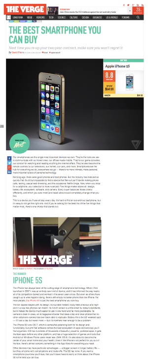
 Now Brian’s site has competition from This is My Next, a new feature at The Verge named after the prototype site which predated The Verge itself.
Like The Wirecutter, This is My Next picks a product category and cuts to the chase. The first installment, which tackles smartphones, declares that the iPhone 5s is today’s best smartphone and HTC’s One M8 is the runner up. It provides brief reviews of them and even briefer capsules on ten other phones you might be considering, such as the iPhone 5c and Samsung’s Galaxy S5. It’s all on one easily-digestible page.
Over at TechCrunch, Matthew Panzarino has a good story on This is My Next and The Wirecutter; among other things, it includes a classy acknowledgement by The Verge’s Joshua Topolsky and David Pierce that The Wirecutter provided them with inspiration for their new feature.
As seen in both This is My Next and The Wirecutter, this less-is-more approach is a refreshing and inventive way to do product reviews. But it’s also a back-to-basics move. More than other online tech reviews, what these evaluations remind me of are the ones we used to do at PC World years ago–back when we were putting them on dead trees, and competed with other magazines doing much the same thing.
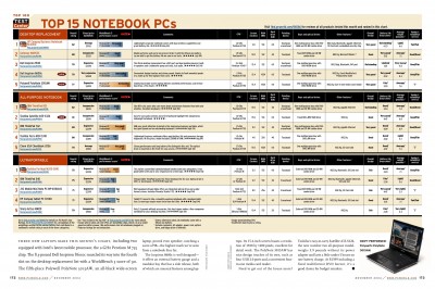
For years, the mainstays of PC World‘s approach to reviews were Top 10 and Top 5 roundups. We generally crammed them onto a page or two–in a magazine, editorial space is a precious commodity, and we had less and less of it as time went on. We’d name a Best Buy or two in each category, so people who wanted a single recommendation could skip the rest of the roundup. And we wrote for people who wanted to buy useful products to get stuff done, not obsessive gearheads.
In time, of course, PC World stopped being a magazine that had a website, and became a website that had a magazine. As we retooled our approach to reviews for the online-first era, we gave readers more and more and more. Reviews got longer, and we provided them for every product we tested, not just the best five or ten in a category. We provided more photography and user reviews and raw data based on the benchmarking we did in our Test Center, and let you sort reviews by various criteria.
It was great for folks who wanted to exhaustively research the field before making a purchase–or who just liked to read reviews of new products, whether or not they were in the market for anything. But we got so giddy over the web’s limitless space and infinite flexibility that we didn’t try to replicate the service we had offered in the print-centric era, when we let readers get in, get a bottom-line buying recommendation, and then get out.
These new reviews’ brevity reminds me of magazine stories, but they aren’t identical in approach to the ones we used to do at PC World. For one thing, we were maniacal about lab testing. We wanted to grind the subjectivity out of reviews in favor of repeatable objectivity, so that two laptops were subjected to the same consistent methodology even if different people tested them six months apart. And in retrospect, we had formidable resources to throw at our roundups–in 2003, we had around twenty people dedicated entirely to reviews and testing, not counting copy editors, designers, freelancers, and various high muckety-mucks involved in the process. We even wrote our own PC benchmark, WorldBench, because we didn’t want to be dependent on anybody else’s.
We were insufficiently grateful for what we had: The staff had once been even biggest, and even at its most enormous, it was smaller than PC Magazine‘s crew. But nobody, including today’s PCWorld.com, does all the things we did back then.
Compared to the old PC World, both The Wirecutter and This is My Next are more comfortable trusting the instincts and opinions of human beings who really know the product categories they cover. (We sometimes had to reconcile weird scenarios in which the opinions of the editors–the ones they would share with friends who asked for buying advice–were at odds with what our lab testing told us.) The Wirecutter also takes into account the advice of writers for other sites–it interviewed Macworld’s Dan Frakes for a review of iPad keyboards–and published reviews at other sites. It’s as if the PC World reviews of a decade or two ago had been based in part on what PC Magazine had to say…a concept which would have short-circuited my brain at the time, but sounds downright sensible now.
I’d never maintain that the technology journalism we did back in the day was anywhere near ideal; in so many respects, the web is a far better medium for learning about tech products than any magazine could ever be. But when the print era went away, we lost something–the sort of to-the-point something which is back in The Wirecutter and This is My Next, and at least as appealing as it ever was.


