Path 2, a Brilliant Smart Phone App With One Annoying, Self-Inflicted Limitation
By Harry McCracken | Wednesday, November 30, 2011 at 1:55 am

A year ago, a new photo-sharing app for the iPhone called Path debuted. It was slick and fun, but the most noteworthy thing about it was an intentional limitation: It only allowed you to connect with up to fifty other users, the theory being that it was for sharing images with your family and close friends, not the world.
Path did OK, but it didn’t become a big hit–unlike Instagram, which arrived at around the same time.
Now Path is back. The new version, Path 2, isn’t just about photos: You can share your textual status updates, your location, who you’re with, and whether you’re awake or asleep. You can also have the app automatically alert people when you travel a great distance and land in a new place. The original 50-friend limit has been bumped up to 150. And you can now push the items you post out to Facebook and/or Twitter.
The Path people now call the app a smart journal, which is as coherent a way as any to describe what it’s doing.
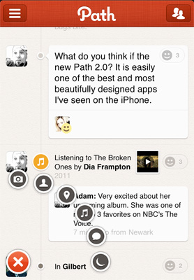
What Path is doing is interesting. But what interests me most isn’t what it does but how it does it. It’s got one of the best user interfaces I’ve ever seen on a mobile app. For the most part, it’s a cakewalk to learn and use. And it just looks great–it’s both highly refined and fun, and clever without being overly cute.
(Side note: I don’t understand why you can only change and retrieve your Path password at a hard-to-find page on the company’s Web site. It’s an odd exception to the app’s otherwise high standard of usability.)
Path’s look and feel are so good that it instantly makes nearly every other mobile app–and especially Facebook–look a bit tired. Really, the only competition it has in terms of pure imaginative flourishes and pixel-perfect fit-and-finish is Flipboard.
My big reservation about Path involves one of the few things about it that hasn’t changed in this upgrade. It’s still meant for sharing with a small circle of “the ones you love,” not random vague acquaintances and utter strangers. That’s why the 150-person cap is in effect.
Maybe it’s just me, but…
…I’m so excited by Path’s interface that I don’t want to use it to communicate with only 150 best buddies and family members. Many of people I love are unlikely to get on Path anytime soon–some of them don’t own smart phones, or just don’t spend much time on any social network. The folks I like to share stuff with are a largely separate group, and there are more than 150 of them.
The prospect of running up against the limitation is a Sword of Damocles that discourages me from getting too emotionally involved with Path in the first place. And the fact that the limit has already gone from 50 to 150 just shows how artificial it is. Why not 450, or 1250, or 2769? Why can’t every Path user decide for him or herself how widely or narrowly to share? Not allowing us to do so smacks of pointless control-freakishness.
I get that the focus on “the ones you love” helps to differentiate Path from Facebook. But the new version is so very well done that I think it could give Facebook a run for its money, at least when it comes to people who do most of their social networking on their smartphone.
Anyhow, enough grousing. If you like well-done mobile apps and have an iPhone or Android handset, you need to check Path 2 out. Here’s an official video walk-through of its highlights.
Comments are closed
Read more:


November 30th, 2011 at 4:55 am
Its easy to use and holds my interest, something which I always look for in apps.
November 30th, 2011 at 4:34 pm
I agree. With flipboard, the best UI on IOS world. Gmail app could do something like Path, btw.
December 1st, 2011 at 3:57 pm
people like to show of a get attention, thats like have a like button that stops at 50
December 3rd, 2011 at 7:47 am
150 = Dunbar's number.
December 6th, 2011 at 9:25 am
Does anybody knows who did the design for Path, was it 3rd party vendor or internal?