Kindle for iPhone Gets Good (Not Perfect, But Good)
By Harry McCracken | Wednesday, May 20, 2009 at 3:37 pm
 Amazon.com, whose first pass at putting Kindle e-books on the iPhone was simultaneously amazing and disappointing, has released a new version of its iPhone app. It’s still not the ultimate iPhone e-reader, but it sh0ws welcome influence from the excellent Stanza (recently bought by Amazon).
Four new features make it worth checking out, and one of them is important enough to turn iPhone Kindle from an app I almost never user to one I’ll use frequently when I have time to kill.
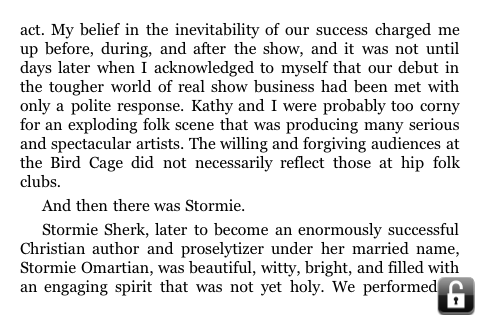
New feature #1 is the ability to read in landscape mode (with a lock that lets you prevent yourself from accidentally jumping from landscape to portrait orientation, or vice versa–nice touch):

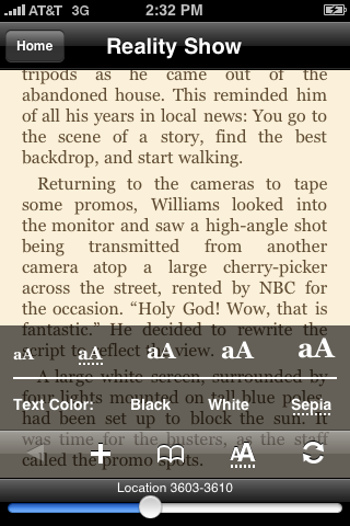
New feature #2 is the addition of two new color schemes: white text on a black background, and a sepiatone mode:

New feature #3 is the ability to pinch and stretch photos with multi-touch gestures (I don’t own enough Kindle tomes with pictures to know if the fuzzy quality shown below is typical or unusual):

I can’t show new feature #4, but it’s the one that has me excited. The original iPhone version of Kindle made you turn pages by swiping them with your finger or thumb. In theory, it was an approriately iPhone-esque way to handle things, but so few words fit on the iPhone at once that swiping through a book quickly gave me a sore thumb. In fact, it was such an unpleasant sensation that I pretty much avoided using the app.
In the new version, tapping on the right or left edge of the page flips you forward or backward, respectively. Much better. I still think Amazon could have handled this even better–you’ve got to make sure you touch the edge, since tapping closer to the middle brings up the app’s options and settings. But I’m grateful to have a version of the app that doesn’t feel–to me, at least–like an ergonomic disaster.
From an aesthetic standpoint, the best iPhone e-reader by far remains the wonderous Classics. It offers only a small library of public-domain works, but its typography is far more elegant and readable than that of either Kindle or Stanza. Maybe Amazon should buy it next, and bolt its elegant front end onto the current Kindle app’s underpinnings?
9 Comments
Read more:
2 Comments For This Post
7 Trackbacks For This Post
-
[TechBlogWatch] Best of Blogs für den 21. Mai 2009: Palm, Gmail, iBoom, iBook, | TechFieber | Hot Gadget Blog. Smart Tech News. Says:
May 20th, 2009 at 9:41 pm[…] iBook: Neue Kindle-App für Apple iPhones ist sehr gut, aber nicht perfekt […]
-
The Palm Pre Revealed: The Technologizer Review | Technologizer Says:
June 4th, 2009 at 5:03 am[…] Then there’s the screen, which packs the same number of pixels (320-by-480) into considerably less physical real estate (3.1″ compared to 3.5″). The extra density makes it particularly gorgeous; it looks less like a piece of electronics and more like a colorful image that happens to be able to change when you touch it. Compared to the iPhone’s screen, though, it’s on the puny side when it comes to text-heavy items such as Web pages. I suspect a Pre e-book reader would be far harder on the eyeballs than Kindle for the iPhone. […]
-
The E-Reader Explosion: A Cheat Sheet | Technologizer Says:
October 26th, 2009 at 12:14 am[…] for other devices: iPhone/iPod Touch, Windows and Mac in […]
-
Kindle for PC Now Available | Technologizer Says:
November 10th, 2009 at 10:16 am[…] since March–it’s known as the Apple iPhone, and it became a Kindle when Amazon released e-reader software for it. The iPhone app has always been able to display color […]
-
Kindle for PC: A Rough Draft at Best | Technologizer Says:
November 11th, 2009 at 2:02 pm[…] it also syncs your location from other places you’ve been reading (such as your Kindle or iPhone) and shows you highlights and notes you’ve made on a […]
-
Five Possible Superkindles Says:
February 4th, 2010 at 11:21 am[…] already offers a decent free Kindle reader for the iPhone. What if it worried less about building hardware and more about building the iPad’s best […]
-
Best of Blogs für den 21. Mai 2009: Palm, Gmail, iBoom, iBook | FREE FILM IZLE Says:
September 6th, 2010 at 1:03 pm[…] iBook: Neue Kindle-App für Apple iPhones ist sehr gut, aber nicht perfekt […]


May 20th, 2009 at 3:48 pm
I’ve always been wary of eBook readers, but I’ve found myself using the Kindle app almost as often as my actual Kindle! I’m looking forward to checking out the changes in this new update.
December 18th, 2011 at 3:18 am
I've always been wary of eBook readers, but I've found myself using the Kindle app almost as often as my actual Kindle! I'm looking forward to checking out the changes in this new update.
Apartamentos en alquiler