Google Logos Get…Attractive!
By Harry McCracken | Thursday, May 21, 2009 at 6:56 pm
I’ve always found the Google logo–whose original incarnation was whipped up by cofounder Sergey Brin in an image editor, though it was later slicked up by designer Ruth Kedar–to to be a little on the nerdy side. (I actually guessed that Brin or Larry Page created it before I knew it for a fact.) And the endless modified versions that the company uses for various services, such as Google Docs, Google Maps, Google Video, and many more? They’re really crude.
None of which is a criticism–in fact, the logos are in tune with what makes Google so lovably Google-esque. Don’t use us because we’re pretty, I’ve always assumed they said. Use us because we’re useful.
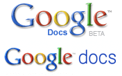
So it is with a heavy heart that I report on the fact that Google is refreshing the look of its various logos, and the new versions look pretty good. Here’s the old Google Docs logo and the new one:

In a blog post, Google’s user-experience honcho Marissa Mayer says that the new logos are more consistent (both across products and across languages). I note that they also shift the emphasis of the branding by shrinking the “Google” and beefing up the modifier, making the various services look more like brands unto themselves. And darn it, they no longer look like someone put them together in a computer lab.
Mayer says that the revised logos will roll out across Google’s portfolio of services over the weeks to come.
3 Comments
Read more:


May 21st, 2009 at 8:37 pm
Perhaps more attractive, certainly no less boring.
May 21st, 2009 at 10:44 pm
yes these new logos are attractive
May 22nd, 2009 at 9:07 am
Guess my geek-dom ends with graphic design, they look essentially the same to me. 😉