The Technologizer Review: Amazon Kindle DX
Amazon's newest gadget is the e-book reader writ large. And pricey.By Harry McCracken | Friday, June 12, 2009 at 8:00 am
 For decades, books have come in two major variants: Big, expensive hardcovers and smaller, cheaper paperbacks. Now Amazon.com’s Kindle e-book line has splintered in a similar fashion: The company has started shipping its $489 Kindle DX, which feels like it’s playing weighty hardcover to the more portable, paperback-like $359 Kindle 2. Like its little brother, the DX is brilliantly cool in some respects and surprisingly clunky in others. Overall, it’s good enough to tempt serious book junkies right now, but also whets the appetite for more advanced book-reading gizmos to come.
The big Kindle has access to the same impressive collection of 285,000 books (many for under ten bucks) as the small one; it also offers the same catalog of thousands of blogs (including Technologizer), magazines, and newspapers. Its 3.3GB of available memory holds up to 3500 books and other reading materials, which arrive in seconds via the wonderfully seamless built-in EVDO connection, which carries no service charge. The display technology remains the monochromatic E-Ink, which looks good in bright light and somewhat murky otherwise, and which sips power so sparingly that it can run for two weeks on a charge if you shut the EVDO connection off. Like the Kindle 2, the DX has a rudimentary Web browser and MP3 player, plus the ability to play audiobooks.
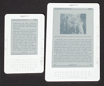
The biggest difference by far is the DX’s 9.7-inch screen, which is not just far more spacious than the 6-inch display on the Kindle 2 but larger than the Kindle 2, period:

The extra real estate lets the DX fit more than twice as many words onto a page than the Kindle 2 does; it reduces the amount of button-pushing you need to do and just plain makes the experience feel more like reading a printed book. Like the Kindle 2, the DX is only a third of an inch thick, but it’s much heavier–18.9 ounces instead of the Kindle 2’s 10.2 ounces. I found the extra bulk slightly distracting–while reading, I was more aware I was holding a gadget, and had to worry more about keeping the Kindle balanced in my hands. It’s not a major strike against the DX, but I noticed that Amazon buries the device’s weight in its description of the device and no longer touts it as a virtue.
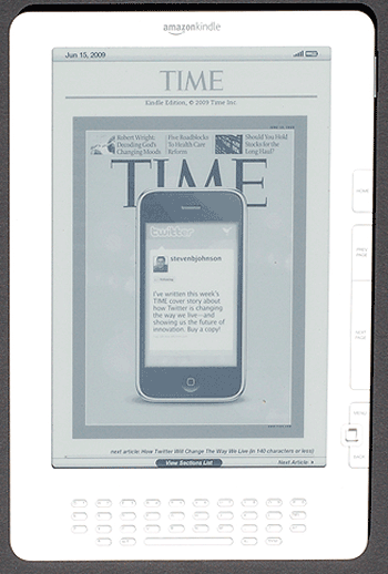
The company has been pitching the DX as a better Kindle for reading richly-formatted magazines and newspapers. But it’s important to understand that the magazines and newspapers it sells aren’t Zinio-like replicas of the originals. The E-Ink display is only capable of providing a rough approximation of photos and other images, as shown by this TIME cover:

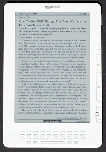
Worse, TIME’s interiors are plain-text only, making for a pretty drab experience no matter how good the articles are. The only new benefit the DX offers is more of that plain text on a page than with the little Kindle:

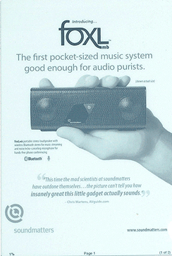
The good news is that the DX introduces native support for documents in PDF form. You can connect the Kindle to a computer via USB and drag PDFs over, or e-mail them to yourself for wireless transfer to the Kindle by Amazon (which charges 15 cents a megabyte for the service). The ones I moved onto the device retained their formatting and looked good given that the Kindle’s screen has only sixteen shades of gray to work with:

As nice as the PDF feature is, I wish that Amazon had also built in compatibility with Microsoft Office documents in .DOC, .XLS, and .PPT form–a feature which the Plastic Logic reader, which is due next year, will apparently offer. (Kindles do handle .DOC documents, but only through Amazon’s for-pay e-mail conversion service.)
The basic Kindle user interface remains the same, with buttons and a tiny joystick for navigating between and within books, plus a QWERTY keyboard for searching and taking notes. But Amazon did make a few tweaks. For one thing, it removed the buttons for flipping forward and backward in books from the left edge of the reader, leaving it with ones for this purpose only on the right side of the screen. Steve Levy, in his review of the DX for Wired, says he misses the left-hand buttons and worries that southpaws will have trouble using the device; both Steve and the Wall Street Journal’s Walt Mossberg speak of lefties having to rotate the Kindle 180 degrees so that the controls and QWERTY keyboard are upside-down, with upside-down labels. That sounds untenable. But for what it’s worth, I’m a southpaw myself but have always clutched Kindles in my left hand and used my right hand to poke at the controls, so the new design still worked.
The DX’s keyboard is a departure from the ones on both the original Kindle and the Kindle 2: The keys are now shaped like Tic Tacs, and there are only four rows of keys versus five on the Kindle 2–you must hold down an ALT key to type numbers. Typing still isn’t much fun, but that’s ultimately not a huge issue, since it’s unlikely that you’ll use the keyboard for tapping out more than a few words at a time.
The worst thing about the Kindle DX is its new auto-rotate feature, which allegedly notices when you’ve rotated the device from portrait orientation to landscape or vice versa and adjusts the image on the screen appropriately. In my tests, this sometimes worked correctly, albeit sluggishly; but it often didn’t flip when I wanted it to, or flipped when I would have preferred that it didn’t. In no case did it contribute to Amazon founder Jeff Bezos’s oft-stated design goal for the Kindle, which is that it be “invisible”–I was always painfully aware I was using a fidgety electronic gadget. Fortunately, you can disable the auto-rotation and adjust the screen yourself as necessary.
Lastly there’s that price–$489, which is $130 more than the Kindle 2, and a fairly stiff cost for a gizmo of any sort. It’s high enough that it’s a factor in my bottom-line Kindle buying advice–which is to consider opting for the Kindle 2. It packs most of what’s good about the DX into a more compact, travel-friendly case. And the virtues of the DX’s bigger display are limited as long as most of its content doesn’t retain book-like graphics and formatting.
8 Comments
Read more:
4 Comments For This Post
4 Trackbacks For This Post
-
Technologizer.Com: Kindle DX Mags and Newspapers “Are Not Zinio-Like Replicas” | Says:
June 18th, 2009 at 1:22 pm[…] Read the original article […]
-
Technologizer.Com: Kindle Magazines and Newspapers Are Not “Zinio-Like Replicas” | Says:
June 19th, 2009 at 11:11 am[…] Read the original article […]
-
Sony’s E-Reader Finally Goes Wireless | Technologizer Says:
August 25th, 2009 at 9:23 am[…] all: News Until now, discussions of the e-book rivalry between Amazon’s Kindle and Sony’s Reader have had to point out that Sony’s gadget lacked the wireless […]
-
One World, One Kindle | Technologizer Says:
October 22nd, 2009 at 4:44 am[…] of this post–there are still two Kindles. But it seems like a safe bet that the big-boy Kindle DX will get AT&T wireless (and probably a price cut) in the next few months. By the time the […]


June 12th, 2009 at 8:19 am
I still don’t get the market viability of a reader with limited doc support, greyscale, that costs as much as a new desktop…
June 12th, 2009 at 11:14 am
the real problem with all the kindles is the ridiculously overpriced drm encumbered e-books. maybe if the device was cheaper the cost of the books would be less difficult to swallow, but i expect to keep the device longer and buy more books. i would probably just use my iphone anyway over a dedicated reader.
June 14th, 2009 at 1:24 pm
Great Review, thanks
March 22nd, 2010 at 5:11 am
A really expensive literature viewer with the ability to take more bucks out of my pocket on downloads. But it’s a nice device with the typical Amazon pro interface and awesome display.