YouTube Streamlines Itself
By Harry McCracken | Wednesday, March 31, 2010 at 10:48 am
![]() Back in January, YouTube started letting users opt-in to a new streamlined interface. It’s now happy enough with the results that it’s rolling out its new video page to everybody. I attended a press briefing at YouTube headquarters this morning at which company executives showed off the revisions, explained the thinking behind them, and said that all users should see them show up by 7pm PT tonight.
Back in January, YouTube started letting users opt-in to a new streamlined interface. It’s now happy enough with the results that it’s rolling out its new video page to everybody. I attended a press briefing at YouTube headquarters this morning at which company executives showed off the revisions, explained the thinking behind them, and said that all users should see them show up by 7pm PT tonight.
The execs told us that there are two types of YouTube users: casual ones who just want to watch a video, and dedicated fans who comment, create subscriptions, and otherwise dig into the site’s features. The new design tries to satisfy both groups, to turn the casual users into fans, and generally make watching lots and lots of videos so easy and addictive that everybody spends more time on the site.
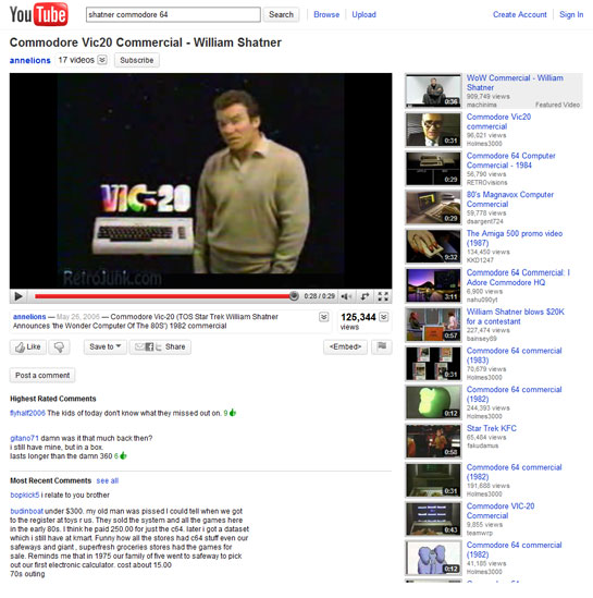
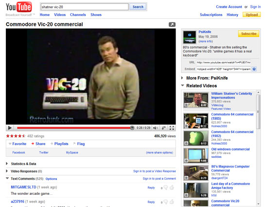
At first glance, the new look doesn’t look all that new: The site’s essentially YouTubiness is intact, and there’s still a lot to do. But over the past few years, YouTube has added new features at a fast clip, and they’ve usually been crammed in wherever there was some white space on the page to spare. Goal one of the new interface was to simplify: It’s got many fewer links and less use of borders, gray shading, and other trim that isn’t completely necessary.
Some stuff has been moved around, too: The details on the uploader are now above the video rather than to its right. YouTube says that makes them more prominent, and also lets the site devote all the space to the right of the video player to other videos the visitor might want to watch, such as related videos, music-video mixes, and subscriptions (which now follow you around the site).
In the past, YouTube used a five-star rating system and let you “favorite” a video to share it via social networks such as Facebook and Twitter. But ninety percent of the folks who bothered to rate a video gave it five stars. So star ratings and favorites have been replaced with a simpler system: You can say that you Like or Dislike a video, and if you choose, that fact will be sent out to your social networks.
YouTube comments still feel like a vast wasteland much of the time, but the highest-rated ones are now at the top–that will make it easier to find the good stuff, and might even encourage more cogent conversation.
This is the biggest makeover YouTube has given itself to date, but the execs who briefed us today say they’re already working on further evolution of the look and feel. For instance, they’re experimenting with using AJAX techniques to create a faster YouTube in which only the videos need to be updated as you click around–an approach they said has a fifty-fifty chance of making it into the service’s interface at some point.
Here’s the new look:

And here’s the old one for comparison’s sake:

If the new YouTube is showing up for you, take a look and let us know what you think….
4 Comments
Read more:
3 Comments For This Post
1 Trackbacks For This Post
-
You can do this! | v i d e o e x p e r t Says:
March 31st, 2010 at 3:54 pm[…] YouTube Streamlines Itself […]


March 31st, 2010 at 11:26 am
Looks like the iPad YouTube interface
March 31st, 2010 at 3:58 pm
It’s actually been showing up for me for a week or two. I’m undecided about it, maybe because I’m looking in the wrong places for things all the time.
I do wish they had never changed the user pages a while back, though — I HATE the new interface for going through all a particular user’s uploads.
March 31st, 2010 at 11:33 pm
Personally I hate it. It looks unfinished, like someone forgot to upload one of the CSS style sheets. Comment threading is nonexistent, it sacrifices usability for “minimalism”, and without borders most of the features look like they’re dropped randomly in the middle of an endless white void. Much of the text has been made smaller, and the video description now looks like it’s just another comment. (They moved it below the video and removed the “subscribe” banners and user icons.)
There’s already over 200 angry comments on YouTube’s announcement. It seems as though they alienated their “hardcore users” who comment and participate regularly to pander to the drive-by viewers. For example, the comment system is a big mess now. You can’t see the comment rating or when it was written without hovering the mouse over it.