Office for the Mac: The Same, Only Different
By Harry McCracken | Tuesday, October 26, 2010 at 7:00 pm
 Microsoft’s Office 2011 for the Mac goes on sale today–the first version to support Office’s Ribbon interface, the first one in years with Outlook, and one that’s priced to move. The company provided me with a pre-release copy a few weeks ago, and when I’ve been using a Mac I’ve been running Office and mostly enjoying the experience. That wasn’t a given: I mostly avoided its predecessor, Office 2008, which was slow and not only lacked the Ribbon but had a floating-palette interface I actively disliked. (I was known to run a virtualized copy of Windows on Macs mostly so I could use Windows Office.)
For some people, the fact that Microsoft–a company who has been known to deride Apple’s customers as trendy spendthrifts–still makes Office for the Mac is apparently hard to reconcile. Microsoft’s press site has a story that seems designed both to reassure Apple fans that Microsoft loves them and Microsoft fans that it doesn’t love Apple fans that much.
One of the fascinating things about Office for Mac is that it isn’t really the same product as Windows incarnation of Office at all. It’s created by a Mac-specific group within Microsoft that isn’t part of the Office team, and which seems to be authorized to go its own merry way. Office 2008, for instance, came out a year after Office 2007 for Windows, yet it pretty much spurned the Office 2007 Ribbon–it did hint at it in a roundabout way–even though Microsoft had been busy pitching it as a much-needed revolution.
Office 2011, on the other hand, has a Ribbon. I say “a Ribbon” because it’s not the Ribbon from Office for Windows.
Here’s the Mac version of Word’s Ribbon:

And here’s the Windows version:

The two versions have different tabs, different icons arranged differently–they’re just different.
When Microsoft shipped Office 2007, it explained that it wasn’t technically feasible to retain traditional menus and toolbars, at least as an option. Well, Office 2011 still has menus and toolbars–in fact, there’s no way to get rid of the menus, and both the old-style toolbars and the Ribbon are turned on by default, leading to an odd user interface with multiple levels of redundancy. You can turn off the toolbar or the Ribbon–or both, for that matter–but you can’t make the interface look anything like its Windows cousin.
(I’m not even going to address the fact that the Office Web Apps have a third variant of the Ribbon interface.)
I attended an Office 2010 workshop in which Microsoft staffers explained how user research taught them that the Ribbon needed to be less visually cluttered than the original version, which is why the 2010 edition removed the outlines from icons. The developers of Office 2011 appear to have ignored this research.
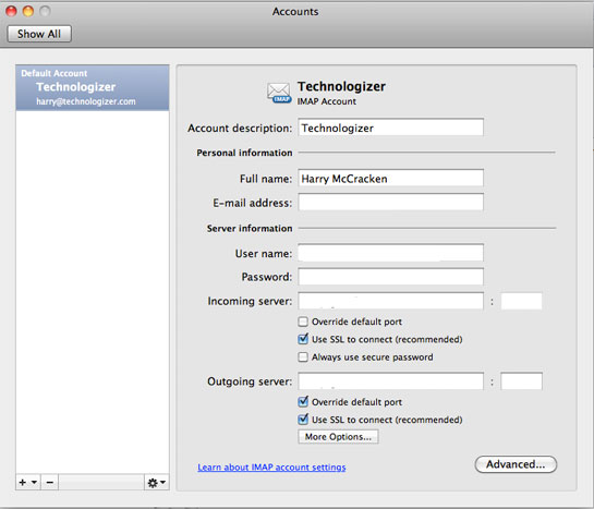
With Mac apps, the assumption is always that users want interfaces that are “Mac-like” rather than warmed-over Windows. (Microsoft’s press story touches on this.) That certainly explains some of the disparity between the Offices, but not all of it. It’s fascinating, for instance, to compare Outlook 2011 for Mac’s interface for adding accounts with the one in Outlook 2010 for Windows.
Mac:

Windows:

They’re fundamentally different, and each has its pros and cons. Windows salts too many features away in dialog boxes and tabs, but has a handy button for testing settings before you finalize them; Mac is better-organized, but doesn’t have the test button. What you really want is something that combines the best aspects of both.
Ultimately, I think the people who design Office for Mac have a huge, not-entirely-solvable challenge. They need to make programs that feel like Mac programs. They need to make programs that feel like Office. And even when they come up with better ways of doing things, any time they change anything in a new version they run the risk of ticking off and/or confusion people who are familiar with the old one.
Maybe that helps explain why reactions to Office 2011 vary so. Macworld’s reviewers are enthusiastic (here’s the evaluation of Word); the New York Times’ David Pogue finds it a major disappointment.
And me, an agnostic computer user who travels back and forth between Mac and Windows all the time? I like Office 2011 a lot more than its predecessor, but psssst: If Microsoft decided to blow away Office for the Mac and replace it with something that resembled the Windows version–at least as much as Photoshop for Macintosh and Photoshop for Windows resemble each other, say–I’d be even happier.
10 Comments
Read more:


October 26th, 2010 at 7:42 pm
Being Windows like does have the advantage of bringing more Windows user to the Mac. Arguably, Office is the main application most Windows business users use the most. Our office still uses Office 2003 because we don't like the interface in Office 2007
October 26th, 2010 at 7:48 pm
I'm with you… when I open an Excel document on my macbook is because I brought work home… and since it is work, I wanna feel like I would in the office… and there I use Windows.
October 26th, 2010 at 7:56 pm
I'll pass.
October 27th, 2010 at 1:33 am
Can't they make the Windows version of Office more like the Mac version?! After all, Windows Seven was modelled on OS X, so why not office? I ended up using Macs by default as after 10 years of using (and developing on) Windows machines as I was desperate for a change – Windows' lack of usability forced me away.
The Windows approach of nested (non-resizable) dialogs is particularly horrid. AFAIK, the dialog to edit your environment path settings is still fixed size in Windows Seven, even though the string being edited is often many times bigger than it can display. IIS6 configuration used to be filled with those atrocities – I really hope that's changed!
Why, after all these years, can't Microsoft fix these trivial usability issues?
October 27th, 2010 at 12:11 pm
Because the Windows version of Office is better than the Mac version.
October 27th, 2010 at 1:13 pm
There is, of course, a cultural difference between the 2 platforms:
On Windows, 'Better' = More features
On Mac 'Better' = Fewer, tightly integrated, features.
Which lies at the heart of the debate.
October 27th, 2010 at 1:15 pm
The Windows version is still far superior. Nicer design, more intuitive design, more features, more sharing features… Unless you care to explain what you mean by 'tightly integrated'?
October 27th, 2010 at 1:28 pm
For me 'tightly integrated' means that the features combine without making the application operation (UI or Process) excessively complex. Heavily nested dialog boxes are just one symptom of complexity.
Ray Ozzie refers to it in his farewell memo to Microsoft: "Complexity kills." he says, "Complexity sucks the life out of users, developers and IT. Complexity makes products difficult to plan, build, test and use. Complexity introduces security challenges. Complexity causes administrator frustration."
October 28th, 2010 at 4:29 am
Is anyone else amused by the irony here? Windows users complain about the non-standard UI in iTunes, and then Microsoft duplicates the problem with the new Mac Office. Honestly, I don't know if many people care about this because the only people I know buying Office are businesses.
October 28th, 2010 at 5:56 am
I don't believe for a second there is a respectable market for Microsoft Office products that shed consistency for Mac-like style. I've never run into such an audience. How hard is it to have the same exact functional layout with a mac-like skin?
It makes more sense to me that Microsoft encourages this developer group to diverge from the standard to attract Mac users to the product while hindering PC users from transitioning to a Mac. I doubt Microsoft wants to make the decision to switch OS's so easy.
I work with educators who sit between the Mac leaning schools and the PC leaning business administrators. As I recently trained a 100+ of them on Office 2010 many hoped the new Mac version would finally mirror the PC version. (They struggle learning anything new related to technology.) Most struggle enough with mastering the new ribbon, and now they cower at the thought of learning two variations of the same software.
How is this truly a user-based design? -It's not.