People who are serious about software should make their own hardware.
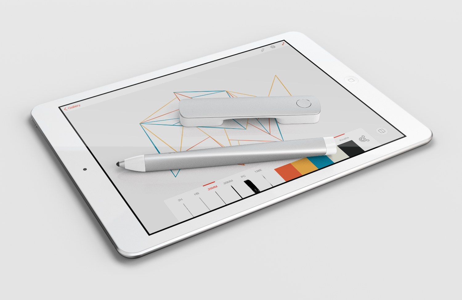
When that famous declaration by Alan Kay gets quoted, it’s usually in reference to ambitious computing devices such as Apple’s iPhone or Microsoft’s Surface. But after more than three decades in the graphics software business, Adobe is finally taking Kay’s advice–and the hardware that it’s built is a pressure-sensitive pen and a unique digital ruler, both for use with new Adobe apps for the iPad.
When the company first showed off prototypes of its pen and ruler more than a year ago, it gave them the code names Project Mighty and Napoleon, respectively. Today, the final versions go on sale as Adobe Ink and Slide. They work with two new Adobe drawing apps for the iPad, Line and Sketch–both of which are free and can be used with or without the new hardware. (Adobe provided me with pre-release versions of the hardware and software, and loaned me an iPad to use with them.)
Adobe is selling Ink and Slide as a set, at an intimidating price: $200. You don’t need to spend anything like that to get a solid iPad stylus. (One of my favorites goes for $35.) But Adobe isn’t being completely irrational: Other pressure-sensitive styli sell for up to $120 on their own, no equivalent to Slide included. Still, it’s a lot of money–and I think that more than a few folks will be disappointed that the company isn’t offering Ink in stand-alone form at a lower price.
The good news is that both gadgets feel like the high-end iPad accoutrements they are. Adobe may be new to hardware, but it’s crafted Ink and Slide out of aluminum and sweated the details.
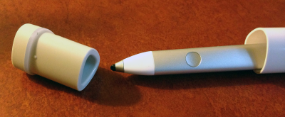
 At first blush, Ink’s striking looks–its barrel is a twisted triangle–seem like they might favor form over function. Actually, the pen fits beautifully in the hand. Many iPad styli are too stubby or too thick; this one is just right, and it’s perfectly balanced.
What matters even more than the shape of an iPad stylus’s barrel is the shape of its tip. The iPad was designed to work with fingertips, not pen points; as a result, most styli have large, mushy tips, leaving using them feeling a bit like drawing with a tiny water balloon. You can learn to do it, but it’s not fun.
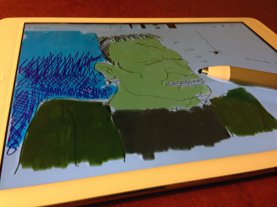
Adobe, however, gave Ink a tip which uses Pixelpoint, a technology created by a startup called Adonit, which also uses it in some of its own styli. Thanks to Pixelpoint, Ink’s point is truly pointy. It’s also pressure sensitive, letting you draw with pencil and pen tools in Line and Sketch which lay down thicker, darker lines if you press harder. Drawing with it feels more like using a real pencil, pen, or brush than with any other iPad stylus I’ve tried.
 Rather than taking a AAA battery like some pressure-sensitive iPad styli, Ink comes with a charging tube which doubles as a carrying case. Stick Ink in the tube, pop on the lid and connect a USB cable, and you can charge it up for up to eight hours of continuous drawing.
Ink is an ambitious new product in an existing category. Slide, by contrast, is something altogether new. Used with Ink and the Line or Sketch app, it lets you lay down lines and shapes with precision, letting you mix purely freehand art with elements you positioned and rendered with the help of Slide.
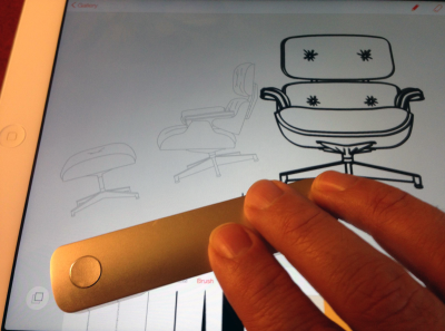
The gizmo is a little aluminum-topped bar, around 4 inches long, on two dinky legs. Even though it doesn’t require a battery, the iPad notices when you’ve plopped it down on the screen. In both Line and Sketch, you can move Slide around to arrange an on-screen line, circle, square or triangle–you cycle between multiple choices by pushing a button on the device–and then size it to your liking and trace it with the stylus to get a shape which simultaneously looks perfect and if it were drawn by hand.
 The Line app provides a bevy of additional shapes which you can position with Slide, such as french curves, trees, various people and animals, and even Herman Miller furniture. It also has a simple 3D-assist mode which helps you with perspective as you lay down lines in a drawing.
Slide is ingenious all by itself, but Adobe did another ingenious thing: It built a virtual version of the hardware into the Line and Sketch apps. Rather than sliding Slide around on your tablet’s display, you can drag around a couple of on-screen circles to position lines and shapes, then trace them with the Ink stylus. It’s a very satisfactory substitute for the Slide device, which makes it all the more of a shame that there’s no way to buy Ink by itself.

Adobe Line
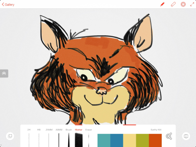
The virtual Slide is only one of plenty of creative features in the Line app (which emphasizes precision) and Sketch app (which skews more towards freehand drawing). They have features such as integration with Adobe’s Behance, a social network for artists who like to show off their work; and Kuler, a way to share color palettes.
But for all the ways in which Line and Sketch are nice, they feel unfinished. They’re also needlessly inconsistent with each other. And though these apps are free–and Adobe says that it intends to release updates with improvements based on feedback from users–they’re the key to unlocking the potential of the $200 Ink and Slide hardware. So their limitations are a problem.
A few examples:
- Even though Line and Sketch have very similar toolboxes which let you choose an art utensil and a color, Line places its version at the bottom of the screen, and Sketch puts it at the top.
- Line lets you customize the size and opacity of its drawing tools; Sketch does not, which limits the variety of effects you can get out of it.
- Both apps are designed to work with an iPad held in landscape orientation; their interfaces don’t rotate into portrait mode, and the lines I drew in portrait orientation looked like they emerged from a spot off to the left of the pen tip.
- Neither app offers the ability to create drawings with multiple layers, as you can in such graphics packages as Photoshop. You can import an image from the iPad’s Camera Roll and trace over it, but the two apps handle this task with different interfaces.
- Both feature palm rejection, a technology designed to let you touch your palm to the tablet’s screen as you draw without unwittingly creating a line, triggering an action or otherwise interfering with your drawing. But like all forms of iPad palm rejection I’ve tried, Adobe’s version isn’t very dependable. And southpaws beware: In Line, there’s a little on-screen button which temporarily disables palm rejection so you can perform gestures such as pinch-to-zoom. It sits on the left side of the screen–where I kept accidentally brushing it with my palm and messing up my work.

Adobe Line
After using both Line and Sketch extensively, I found I liked Line better for the sort of precision drawing it’s designed for and for freehand sketching. Which brings up a question: Why does Sketch exist at all? Adobe says that it created two separate apps to avoid feature bloat; it’s a noble-sounding goal, but most of the few unique features which Sketch has could be folded into Line without overloading it.
Ultimately, of course, what you really want is for Ink and Slide to work in any iPad app which might benefit from them–including excellent non-Adobe offerings such as Paper, Procreate, and Sketchbook Pro. Adobe says it’s planning to open up Ink and Slide so that other companies which develop graphics software can enable the hardware in their apps. Whether they will choose to do so remains to be seen–especially since Adobe’s Ink competes with multiple other high-end styli which require their own special software support, such as Pogo Connect, FiftyThree’s Pencil, and Adonit’s Jot Touch.
The bottom line on Ink and Slide: They’re impressive, polished pieces of hardware already, but they’ll be far more compelling if Adobe beefs up Ink and Slide and third-party app developers support the devices. Spending $200 on them right now is a major investment in a vision in progress. But it’s an awfully exciting vision–and if it comes to pass, it’s going to be a boon for iPad art and the people who create it.
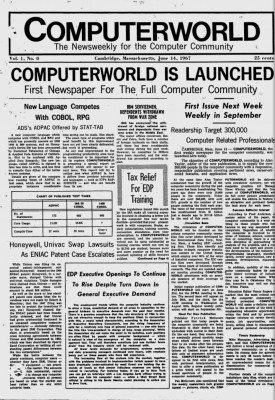 When IDG’s Computerworld launched, with an issue cover-dated June 14, 1967, it declared itself to be the “first newspaper for the full computer community.” I have no reason to believe that was an inaccurate claim. And if there’s an older publication devoted to computing which still exists in print form, I don’t know about it.
