 (UPDATE! I’m conducting a poll about Chrome–please go here to take it, and to get a recap of all of Technologizer’s Chrome coverage.)
I promise to publish a coherent evaluation of Google’s Chrome browser later today–but coherent evaluations take time. Right now, I’m playing around and exploring and seeing what happens. And I’m going to share what I learn in this post (which I’ll update as I have stuff to say).
The download and install: Fast and easy, as is just about always the case for Google products. The company probably doesn’t get enough credit for that–it’s the exact opposite of the classic Microsoft download that tells you that you need some other Microsoft download you’ve never heard of, then makes you reboot.
Flash: I visited a site that uses it, and got an error message and an invitation to click to install it; I clicked, and got another error message. I couldn’t believe that the company that owns YouTube would release a browser that didn’t support Flash out of the gate, so I went to YouTube. Got another error, and a link to Adobe’s download site. Download site tried to identify my browser, but thought it was Firefox or Safari or Netscape and didn’t mention Chrome. I had to do a semi-manual install of Flash, rather than the seamless install I’m used to. But it’s working.
User interface initial impressions: Google’s definitely trying to clear out clutter and preserve as much space as possible for the Web site you’re on rather than the browser UI–which is both pleasing and kinda ironic given that the name “Chrome” comes from designerspeak for browser UI elements. The tabs sit up in what’s normally the Windows window bar; as far as I can tell, Chrome doesn’t show you the title of the page you’re on, which is usually what sits up there. Potentially confusing? In theory, at least.
Chrome also has no standard Windows menus. When Microsoft removed menus by default in IE7, it drove me bonkers, and I apparently wasn’t alone, since they came back in a later update to IE7 (albeit in a weird, non-standard location). Chrome does have two menus–one, which you get by clicking a little page icon, gives you access to commands relating to the page you’re on. The other, accessed from a wrench icon, provides settings. So far, it seems logical enough–it’s certainly easier to blow away standard menus when you’re a brand-new browser rather than one with more than decade’s legacy of having normal menus.
Like IE7 (and IE8), Chrome also messes with the expected organizatin of elements at the top of the browser–the tabs sit above the address bar rather than below it. Seems to work.
Like IE8, Chrome attempts to make URLs more readable by bolding the main address and greying other parts of the URL. So far, I’m thinking that this may make them harder to read, not easier.
I’m already missing Firefox 3’s “Awesome Bar”–my fingers are conditioned to use it, and Chrome doesn’t replicate its ability to type random parts of a URL and go there.
Search: I’m used to browsers sporting a search bar to the right of the address bar. Chrome doesn’t have one–presumably to conserve space–and instead lets you search by typing keywords into the address bar. The default search engine–you’re going to be stunned to hear this–is Google. But you can switch it to Live Search, Yahoo, AOL, or Ask. And there’s a feature for adding other search engines, although it looks a tad cryptic.
Speed: It’s dangerous to come to any conclusions based on a few minutes of tooling around, especially when the browser developer has told you that a browser is uncommonly fast. But Chrome does seem pretty zippy so far. I’m blogging this in Chrome, using WordPress, which can feel sluggish. In Chrome, it’s quick, which makes it a lot more pleasant to use. So far, at least. Toggling between normal editing mode and full-screen mode in WordPress happens nearly instantaneously.
Bookmarks: Since there are no standard bookmarks, the bookmark bar seems to be the only fast way to get to your bookmarks. And it seems to be turned off by default? Odd–it may be a sign of excessive dedication to blowing away clutter. But you can turn on the bookmark bar easily enough.
Passwords: Chrome asks you if you want to save ’em using a top-of-the-page bar that’s identical to the one in Firefox 3–much better than a dialog boxes that gets in your face until you get rid of it. On the other hand, password management is hidden in a “Minor Tweaks” tab in the Options settings. I don’t think it would occur to me to look there, and I’m not sure why Google would call a settings tab Minor Tweaks at all, if it was attempting to build a browser that would appeal to non-geeks.
Also, the password reminder didn’t notice I’d logged into Twitter the first time, and doesn’t notice I’m logging into Zoho. Or at least it would seem that it didn’t notice–it didn’t ask me if I wanted to remember those passwords.
Integrated Gears: Chrome comes with the Gears offline framework built in. Looks like the main thing this does is save you a download–when I tried to use Zoho’s offline word-processing feature, I still had to authorize Gears to work with Zoho. Once I did, it worked fine.
Google logo: There’s one in the upper right-hand corner of the Chrome interface. It doesn’t seem to do anything. Shouldn’t it take you to Google?
Create application shortcuts: Chrome has a feature that lets you add a link to a Web page to your desktop, Start menu, or Quick Launch toolbar. It’s no big whoop, but I don’t think I’ve seen it in other browsers. And it’s the sort of thing you’d do if you wanted to train users to think of sites the same way they think about desktop applications.
Web History: Along with thumbnails of my nine most-visited sites, the default Chrome start page gives you a Web History feature that lets you find stuff in pages you’ve visited in the past. Nice–but as far as I can tell, it only searches pages I’ve visited in this copy of Chrome. Shouldn’t it tie into Google’s existing Web History feature, which records my wanderings in any browser that I’m signed into Google on? At least optionally?
Zoom: Chrome seems to have an old-fashioned zoom feature that just changes the type size and leaves graphics alone. These days, IE, Firefox, and Opera can all make the entire page larger or smaller.
Incognito: Like IE8, Chrome lets you easily browse the Web without leaving any traces of where you went or what you did. The explanatory text warns you to be careful about “Surveillance by secret agents” when you use this feature. These days, I can’t tell whether that’s serious or in jest.
Find in Page: It’s very similar to the new one in IE8, except that the search box and related tools sit on the right-hand side of the screen near the top rather than the left-hand side, and don’t span the entire screen. (I’m now officially coming to the conclusion that Google was fanatical about the Chrome IE requiring no more space than absolutely necessary.) Once you open the Find bar, it only stays there until you travel to another page, and is only visible in that tab. I do a ton of searches within pages, so I’d much rather it just stayed there. (As far as I know, no browser lets you simply leave the Find bar permanently open.)
Okay, I’m done with random thoughts. A more organized evaluation will follow…
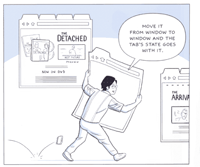
 Was it only day before yesterday that we got the startling news–via the startling medium of a graphic novel by a leading cartoonist–that Google had secretly been working on a Web browser and was about to release it? Yup–and it was only yesterday that that browser became available for download.
 I have a soft spot for TiVo, so today’s list is topped by some good news about the DVR that remains synonymous with DVRs. Plus: Two Google Chrome items (inevitably!) and two iTunes items!
 (UPDATE! I’m conducting a poll about Chrome–
 (VITAL UPDATE! If you came here looking for a Google Toolbar for Chrome, the bad news is that there isn’t one. The slightly less bad news is that it’s possible to construct a rough approximation–
 (UPDATE! I’m conducting a poll about Chrome–
 (UPDATE! I’m conducting a poll about Chrome–


 (UPDATE! I’m conducting a poll about Chrome–