Has YouTube ever done a truly sweeping redesign? If so, I don’t remember it. Mostly, I think of the scads of features the site has added–many of which are useful, but all of which have led to a cluttered experience.
Today, YouTube is launching a major makeover of its video playback page, based on feedback from users. For the moment, it’s not replacing the old one–it’s an opt-in feature which you can get by going here. The company says the plan is to get further feedback from users and tweak it further before it becomes the default interface
The major goals were to reduce the amount of wordage and graphics that weren’t completely necessary; to make the most popular features easier to find; and to keep the emphasis on the video being viewed (which could be either hilarious or sobering) rather than the interface. Even the site’s “Broadcast Yourself” slogan is gone in the interest of streamlining.
Also gone in the new version: star ratings. (Instead, you give a video a “Love It” or (“Thumbs Down”) rating. All in all, the site looks much more like a product of its parent company, Google.
Here’s the new look:

And here’s the older, busier version:

The company says that for this first version of its new look, it tried to err on the side of taking things away and removing labels–even the comments no longer have a header explaining that they’re comments. If they get feedback that any of the changes went too far, they may backtrack a bit.
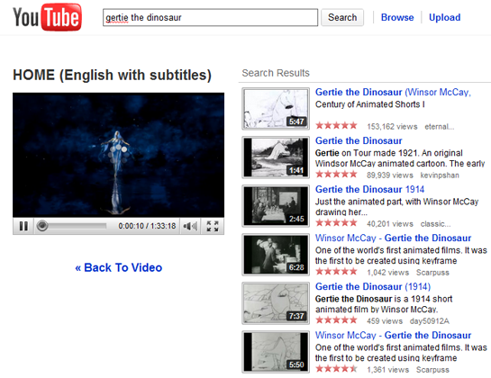
YouTube hasn’t completely redone the other important part of the site–search results–but it is experimenting with a new format that leaves the video you’ve been watching onscreen in a smaller window when you search for something new:

It’s going to take a while for me to get used to some of the changes–like the information about the video’s uploader moving from the right-hand side and being split up into chunks above and below the video–but overall, this looks like good stuff. It’s certainly less claustrophobic than the old version.
If you check it out, let us know what you think.


 Am I the only one who finds the current public squabble between YouTube and Viacom a tad unseemly? The opening briefs in Viacom’s copyright suit against YouTube were made public yesterday, and YouTube used the occasion as reason to post


