Don’t Fear Pegman: New Google Maps Street View is a Winner
By Harry McCracken | Tuesday, November 25, 2008 at 4:06 pm
 McCracken’s Law of Software Mascots states definitively that they’re almost always a truly lousy idea. Most of the evidence has come in the form of grating, patronizing Microsoft characters, from Bob to Clippy to Rover, the miserable mutt who shows up in Windows XP’s search. So I was alarmed when I heard that Google Maps’ amazing Street View photographic imagery feature had been updated with a new interface involving a mascot. Named Pegman. Who, in an image in the Google Blog post announcing the news, seemed to be channeling Clippy:

He’s also exuberantly obnoxious in Google’s explanatory video on the new Street View features, which he narrates:
The good news? In Google Maps itself, Pegman is your friend. He really does help make using Street View easier. And Street View is better than ever in this new version.
When you’re not using him, Pegman (who looks sort of like Pac-Man, except with a body and without a mouth) stands in waiting in Google Maps’ navigational controls on the left-hand side of the map:

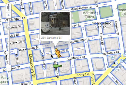
When you drag him out of his nook onto the map, he provides a thumbnail Street View preview of wherever he’s hovering (assuming that the area is covered by Street View). He’s even smart enough to show the left or right side of the street depending on where you plunk him:

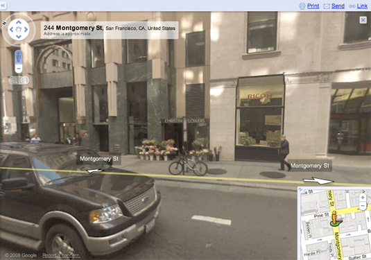
Release him onto the map, and you go into Street View mode, with a larger window than before and a nifty little overview map that lets you nudge Pegman around to travel to other areas:

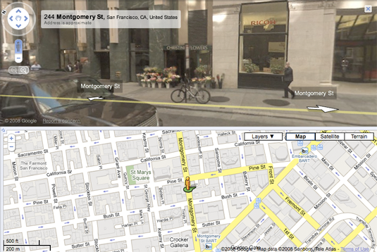
And you can flip into a view that’s 50% Street View and 50% map:

Lastly–and this has nothing to do with Pegman, but it’s new and smart–you can also get to Street View by simply zooming in on the map. When Street View exists for a region, Google Maps shows it as the most-zoomed-in view.
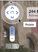
Oh, and I forgot: You can also use a new control to whip around the Street View scene in 360-degree splendor. It’s hard to show with a still image, but trust me, it’s neat:

Google Maps was already among Google’s most inspired creations, and Street View was its showstopper feature. The new user interface is innovative, intuitive, fast, and fun–one of the very best interfaces I’ve ever seen on software of any sort, ever.
Which is not to say that I might not love it as much or more if Pegman was a nameless, non-anthropomorphic pushpin or something…
8 Comments
Read more:
5 Comments For This Post
3 Trackbacks For This Post
-
Recorre las calles de Google Maps con Pegman - FayerWayer Says:
November 26th, 2008 at 6:19 pm[…] googletizado) con el que podrás navegar en los mapas y reconocer los lugares con imagenes. [Vía] […]
-
IT 2.0 Blog » Google Maps überarbeitet mit Vollbild Streetview Says:
November 28th, 2008 at 1:36 pm[…] Technologizer.com […]
-
Bing Maps’ New Beta: Interesting, Promising, Erratic | Technologizer Says:
December 2nd, 2009 at 9:57 pm[…] interface is really similar to Google’s down to the use of a doppelganger of Google’s Pegman to help you navigate your way […]


November 26th, 2008 at 7:16 am
I use Google Earth and was thinking exactly the same thought just yesterday – Zooming all the way in should “land” you on the ground so you can look around.
Combine with the built in flight sim and I’ve got a real life GTA4! 🙂
November 26th, 2008 at 9:22 am
Noooooo. Zooming all the way in should show you all the geological layers between the street location and the center of the earth.
December 2nd, 2008 at 6:43 am
I just don’t get it. The “pegman” was already there since the beginning.
The only difference is that its draggable icon replaces “street view” button for accessing the feature. Big deal…
For the rest, I really don’t like the interface update.
The split pane view is claustrophobic, too less vertical space for both the map and the street view.
You get a bit lost in the map, and just can’t have a decent view of the sideway buildings.
Full window street view has that annoying map box in the corner… too small to aid navigation, but big enough to get constantly in the way of the view.
In the end, the old balloned/full screen view was much more effective.
The new circular widget for rotating the view… well it’s cool but totally unnecessary, apart for showing where’s the north. Why poke with that small circle and arrow when you can just click and drag the whole view?
I don’t like even the new zoom slider and pan control for the map. New color and shape make it confusing itself with the map graphics, giving the feel of a more noisy interface.
Well maybe I’m a nitpicker, but I really dislike this update
December 2nd, 2008 at 12:21 pm
I agree completely with abu – I don’t like the Street View changes. It is much more difficult to use now. I wish there was a way to revert to the older version.
January 31st, 2011 at 4:44 am
I use Google Earth and was thinking exactly the same thought just yesterday – Zooming all the way in should "land" you on the ground so you can look around.