Zoho Writer Gets a New Look
By Harry McCracken | Thursday, March 5, 2009 at 12:11 pm
![]() AdventNet, the company behind the bulging Zoho suite of productivity services, was one of the first to build Web apps that looked and behaved like traditional software–and it’s gone on to play an industrious, intrepid David to Google’s Goliath in the world of online office suites. Today, it’s given its flagship Zoho Writer word processor a major makeover, with a new interface that combines aspects of Microsoft Office 2007’s “Ribbon” interface and the more familiar menus of older Office versions into something that’s distinctive in its own way.
AdventNet, the company behind the bulging Zoho suite of productivity services, was one of the first to build Web apps that looked and behaved like traditional software–and it’s gone on to play an industrious, intrepid David to Google’s Goliath in the world of online office suites. Today, it’s given its flagship Zoho Writer word processor a major makeover, with a new interface that combines aspects of Microsoft Office 2007’s “Ribbon” interface and the more familiar menus of older Office versions into something that’s distinctive in its own way.
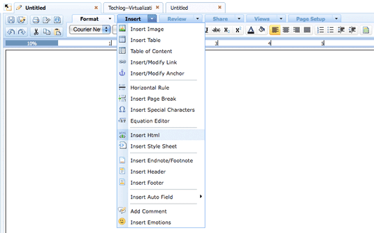
Zoho calls this MenuTabs, and simply put, it lets you get access to a set of commands–such as tools for inserting various elements into a document–either as a menu:

Or as a tabbed toolbar of icons:

Me, I’d go for the menu every time: Unlike Office 2007’s ribbon, which sports sizable, reasonably easy to decipher buttons, the Zoho toolbars have tiny icons that require a moment’s thought to decipher. The menus, on the other hand, explain functions in plain English. But it’s cool that Zoho lets you choose between the two approaches. (When Microsoft introduced the Ribbon, it did away with menus in their old form.)
Zoho has also upgraded Writer’s sidebar, which gives you access to files you’ve created and lets you perform tasks such as renaming them, moving them to the Trash, and sharing them–including bulk actions on multiple files in one swoop. It’s a nicely done, highly convenient feature, and I wouldn’t mind it a bit if both Google and Microsoft swiped it.
I’m currently trying out the new Zoho Writer in the only fashion that really matters: by using it to do some real work. More thoughts as I have them, but for now, I’m enjoying reacquainting myself with it.
1 Comment
Read more:


0 Comments For This Post
1 Trackbacks For This Post
March 9th, 2009 at 6:39 am
[…] Zoho Writer Gets a New Look (technologizer.com) […]